- - Brand Identity
- - Package Design
20th anniversary of its birth, to a full-fledged face
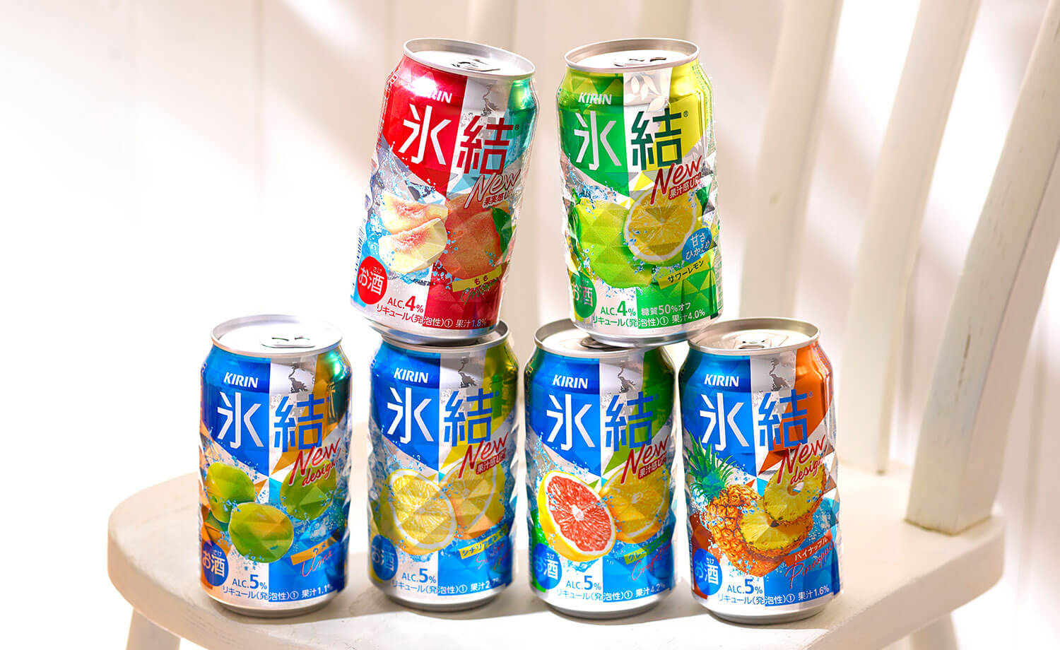
The Kirin Hyoketsu brand has been a leader in the chuhai market since its inception in 2001. The brand continues to offer a refreshing, crisp taste and has been highly acclaimed by many consumers for its drinkability and fruitiness.
In recent years, the RTD market has been expanding due to the diversification of consumer thinking, and the easy-to-drink taste and fruitiness of the product have been supported by the growing market. In this growing market, Hyoketsu is celebrating its 20th anniversary and has undergone a product renewal to enhance the refreshing and refreshing taste of fresh fruit and satisfy many consumers. The packaging was also renewed, and Bravis was in charge of the package design.
The renewal of the Hyoketsu brand needed to express the authenticity of the sake more than ever before to satisfy many consumers, while utilizing the brand equity of Hyoketsu in terms of taste and refreshment.
The design was changed from the radiant, bouncy design of the previous package to a simple, easy-to-understand two-tone design in the brand colors of navy blue and silver, with darker colors and smaller fruit sizzles to create more space. The design is simple and easy to understand. In addition, the can’s diamond-cut design, which is a major feature of the Hyoketsu brand, is clearly visible in the silver portion of the can, enhancing the Hyoketsu brand.
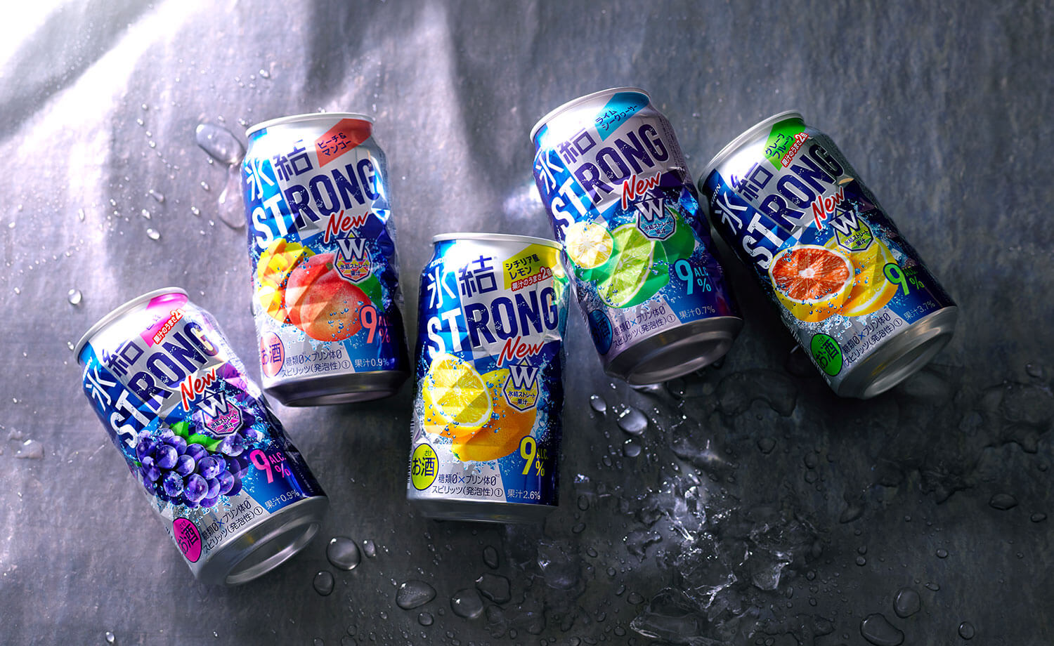
The Strong series, also under the Hyoketsu brand, has been redesigned in a format similar to that of the regular series to strengthen the Hyoketsu brand as a whole. The renewed package design is designed to appeal a sense of authenticity befitting the 20-year anniversary of the brand.
Bravis was also in charge of developing the package design for the seasonal flavors, with a design that expresses a fruity and refreshing taste.