- - Package Design Development
A long-selling brand that changes over time
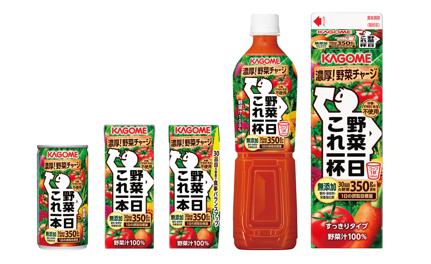
Kagome is a leading company in processed tomato products and a top manufacturer of vegetable juices. “Yasai Ichiniti Kore Ippon(Ippai)” utilizes Kagome’s specialty concentration technology, and is made from 30 kinds of vegetables with a focus on taste and nutrition. It is a vegetable juice that can be ingested.
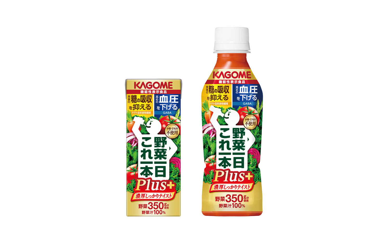
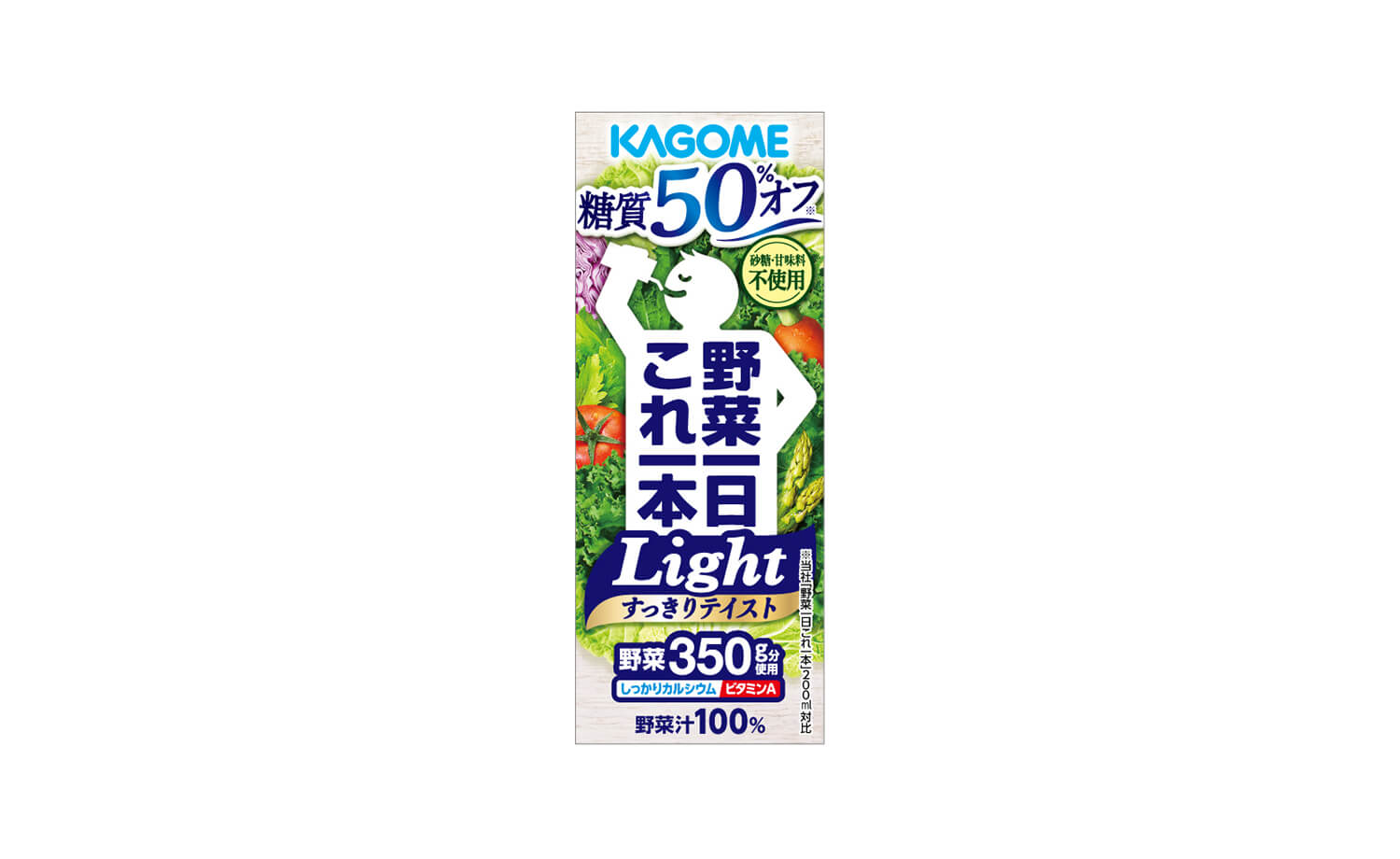
Bravis has been developing package designs for many years since the launch of the “Yasai Ichinichi Kore Ippon” brand. In addition to the core products, we also have a series of products such as “Yasai Ichinichi Kore Ippon Light” with 50% less carbohydrates, “Yasai Ichinichi Kore Ippon Plus” with functional claims, and “Asano Fruits Kore Ippon”. I also do product packaging design.
In the package design of the flagship product, the border line was strengthened so that the white silhouette of the person, which is the brand equity, stands out even at the storefront. In addition, by putting a hand on the waist so that the silhouette of the person looks like he is drinking this product, and by using a rounded font for the logo, more people can have familiarity and attachment. I’m doing something like this. In addition, the vegetables on the back are arranged so that each color stands out, and the design is such that the freshness and healthy image can be appropriately appealed in various capacities, materials, and shapes.
“Yasai Ichinichi Kore Ippon Plus”, which is the first food with functional claims of the brand, has a functional claim that “suppresses the absorption of sugar and suppresses the rise in blood sugar level after meals” and “lowers high blood pressure.” ” and renewed in January 2022. In the package design, while following the face of the brand, in order to effectively appeal the added value of foods with function claims, we made sure that the brand name and added value are seen as a single unit.
In addition, compared to the main product, the silhouette of the person has a dignified face, and the panel is set so that the two functions can be clearly seen. By using gold as an accent color, it expresses a special feeling and high functionality in the series.