- - Brand Identity Development
- - Package Design Development
Revitalization of long-selling brands
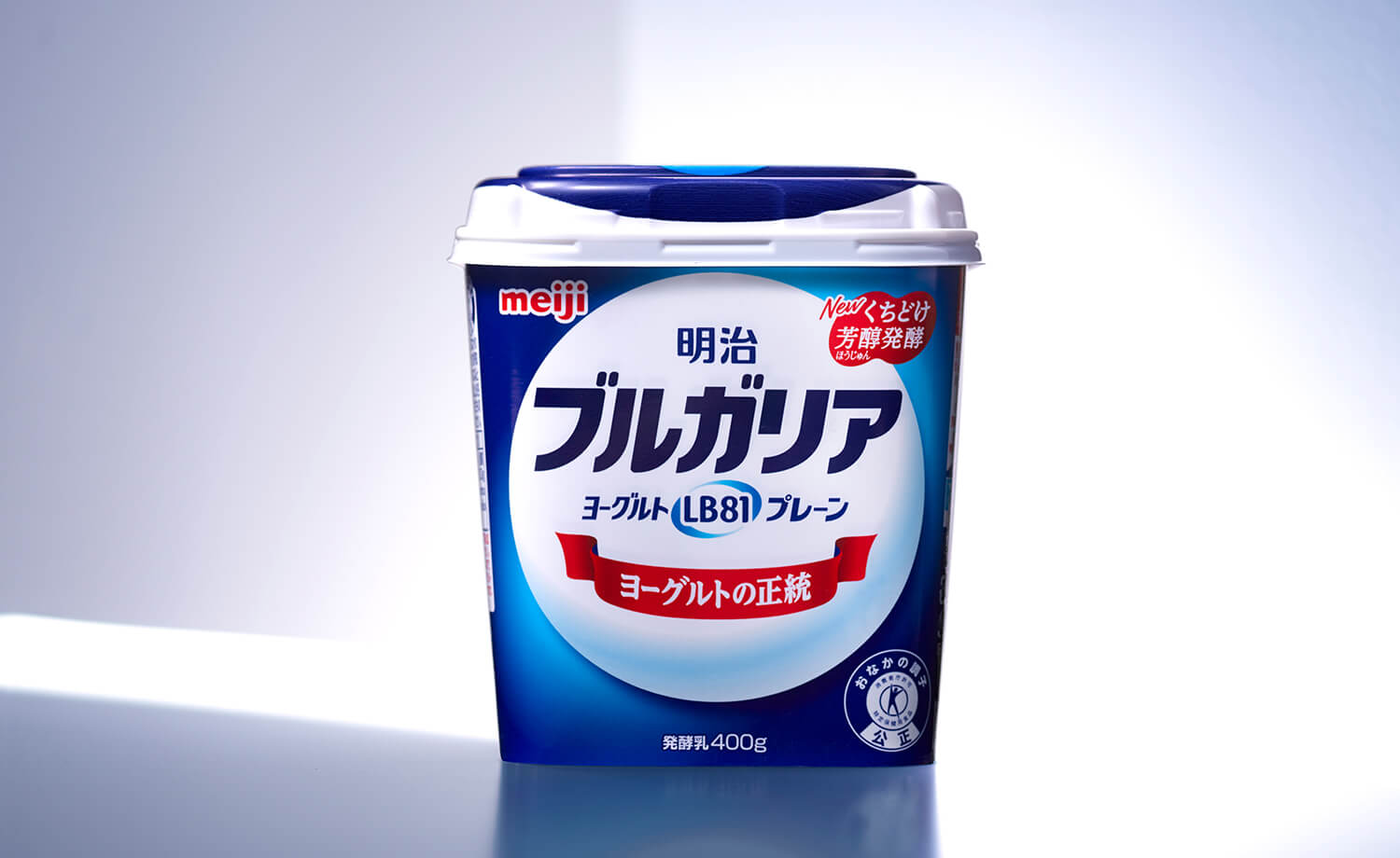
In the 1970s, Meiji worked with the Bulgarian government on a project to introduce traditional healthy yogurt-making techniques to Japan.
As a result, Meiji’s Bulgaria brand has earned a reputation for authentic yogurt since its launch. However, like other well-known brands, “Bulgaria” needed a brand strategy that could evolve into a brand appropriate for the times while maintaining its brand identity.
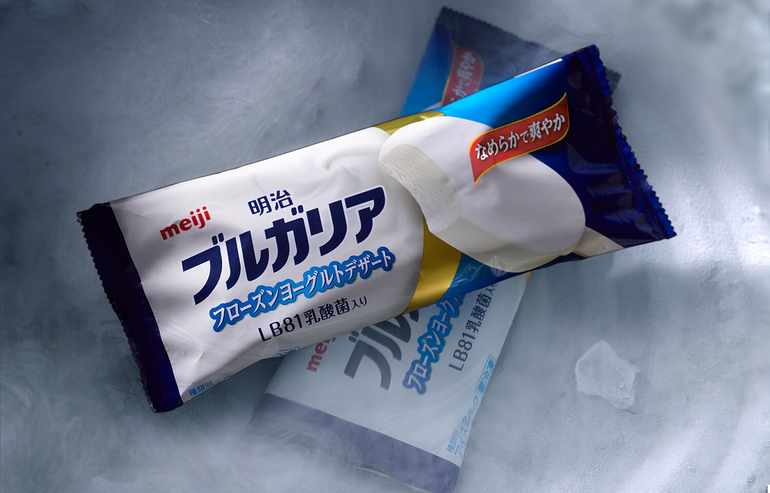
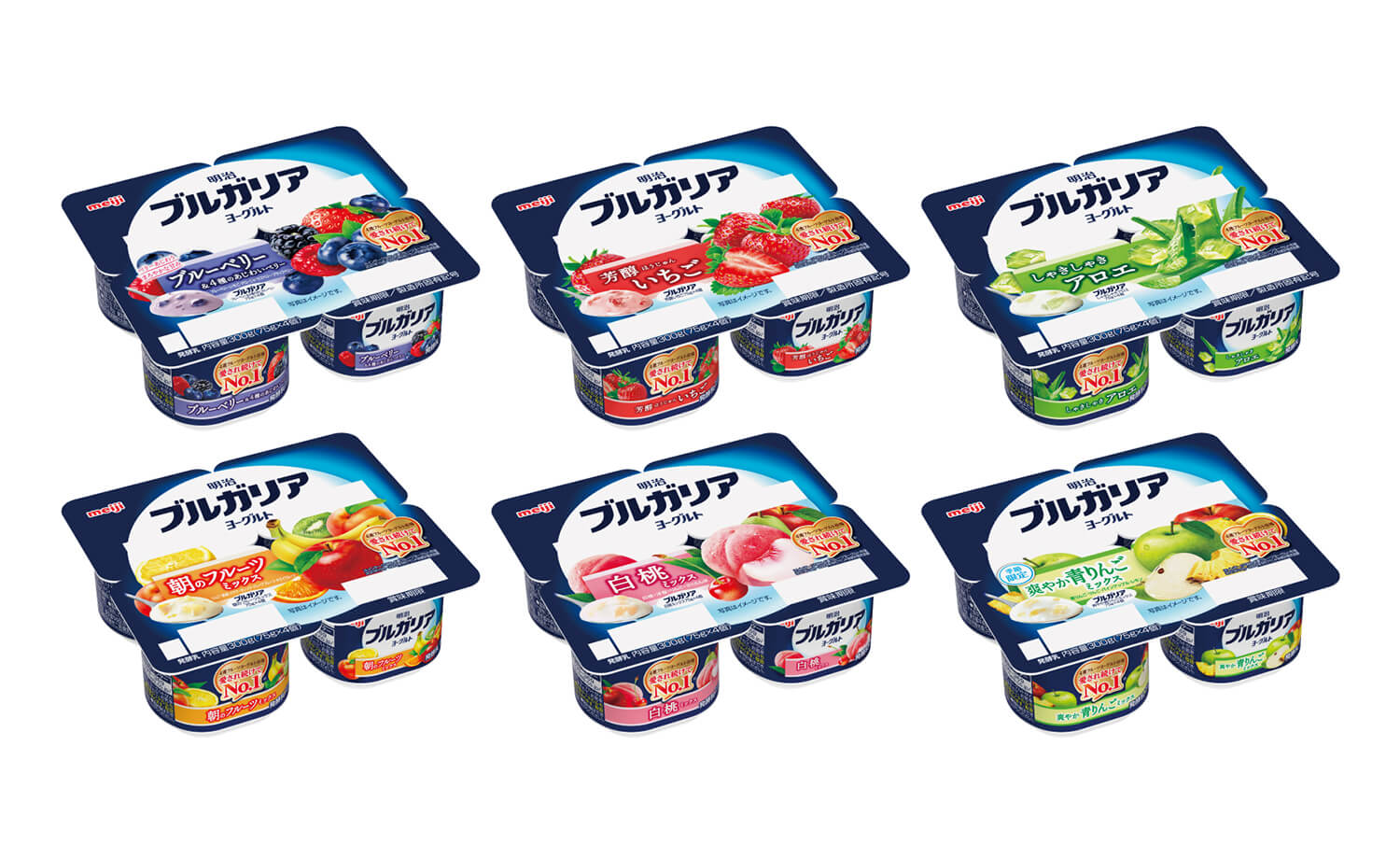
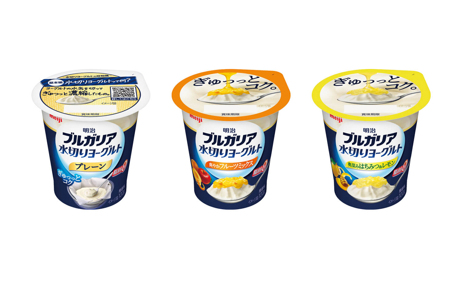
Bravis has been involved in the renewal of the brand for more than 25 years while maintaining the brand logo and blue and white brand colors as equity, and in the past, in addition to yogurt, Bravis has also been responsible for the packaging of yogurt cake, frozen yogurt, and yogurt desserts that were sold under the Bulgarian brand In addition to yogurt, he has also been in charge of package design and development for yogurt cake, frozen yogurt and yogurt desserts.
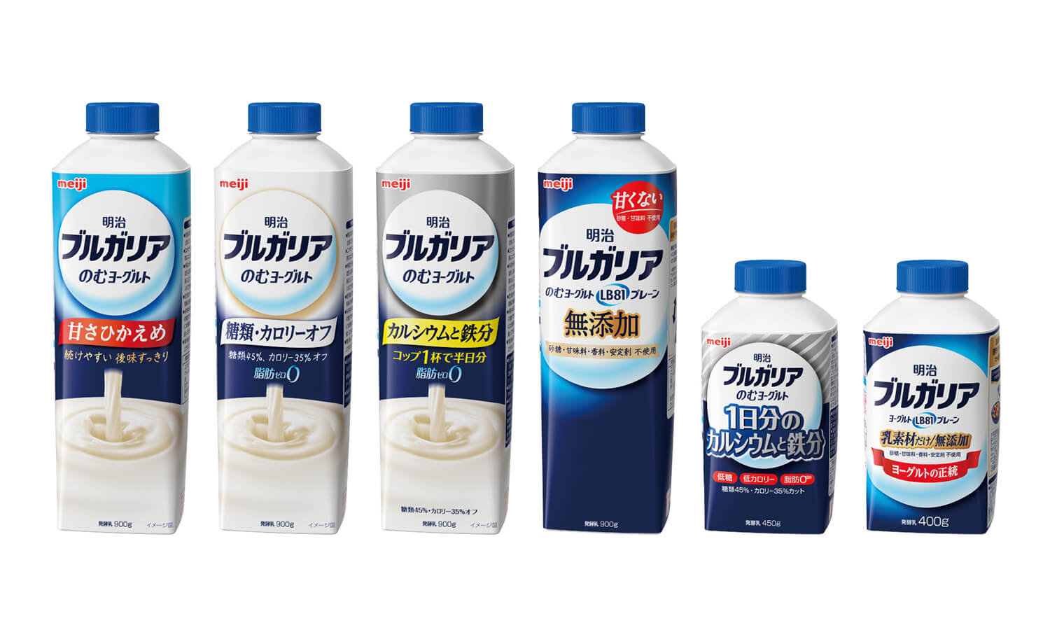
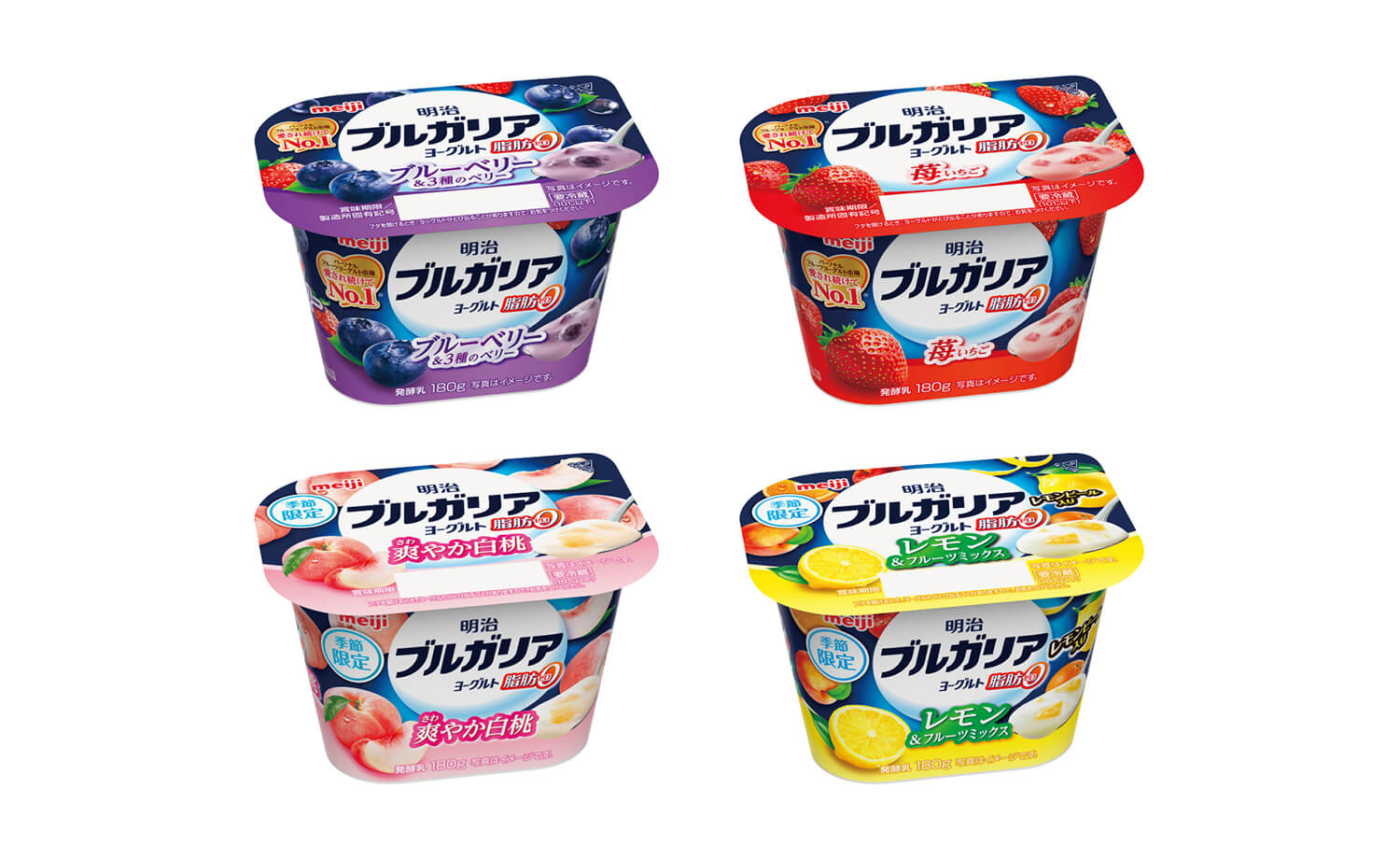
Today, he is still involved in adjusting the classic Bulgaria brand identity to the design of the times, as well as developing the package design for the brand extensions, from basic yogurt to flavored yogurt, yogurt drinks, etc.
The distinctive blue color, one of Bulgaria’s brand assets, is commonly used on the package sides and top caps of the products in the series to create a sense of brand family and to visually differentiate the Bulgaria brand by creating a large blue mass on the sales floor. The new product line has a family feel to it. The brand is leading the market as a leader in yogurt products.