- - Brand identity development
Rejuvenate popular brands
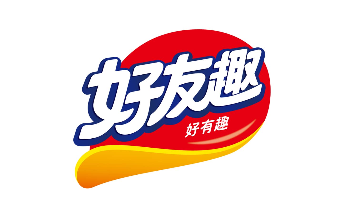
The “好友趣” brand of potato chips from Orion, one of Korea’s leading confectionery manufacturers, had undergone minor changes since 2006, but since there had been no major renewal, the brand needed to appeal to consumers with a new image and strengthen the sense of unity across its various product lines.
An analysis of the current brand identity (BI) revealed that the panel resembling a potato chip and the brand colors were important brand values that were widely recognized and liked by consumers. In order to rejuvenate the brand identity while maintaining the current brand identity, we emphasized the overall three-dimensional effect and increased the area of yellow to create a more pop-like form that evokes the deliciousness of potato chips. In addition, the brand name “好友趣” was designed with a softer typeface and fewer strokes to improve readability and leave a lasting impression at a glance.
The brand identity has evolved into a new “Koyu Shu” brand identity that is loved by people more by enhancing the brand value while leveraging the familiarity of “Koyu Shu” among consumers.