Rohto Pharmaceutical
- - Package design development
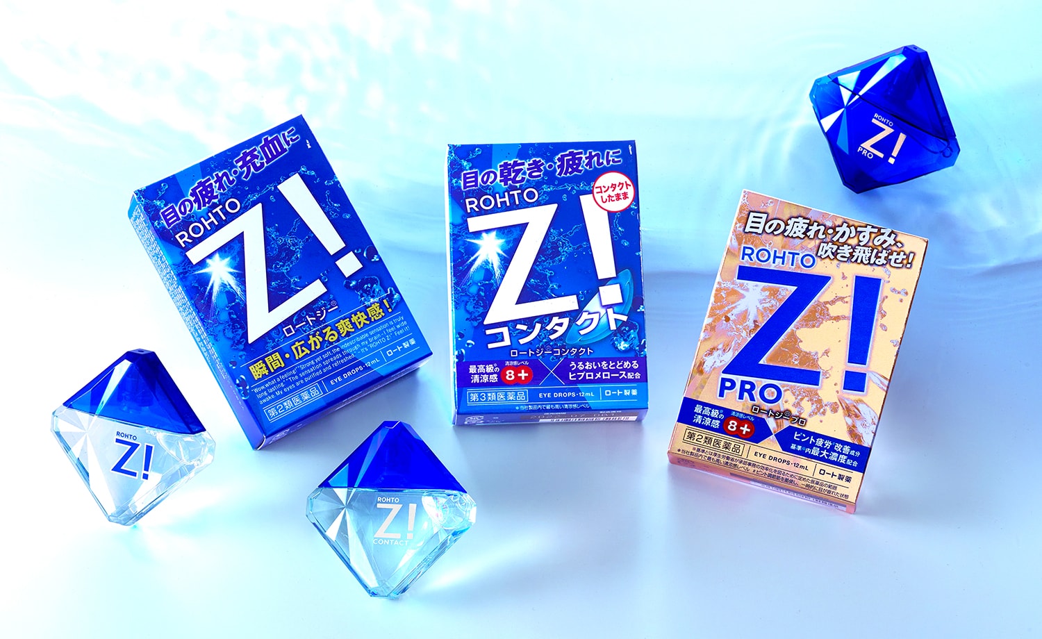
Expressing the Best Refreshing and Effective Sensation for Tired Eyes
The overall design of the Rohto Z! series, which has remained unchanged for about 10 years, was renewed to coincide with a change to a more refreshing formula for the higher-end product in the series, Rohto Z! pro, which refreshes tired eyes.
While the large, centrally placed “Z!” logo, a brand asset, is retained, the background flash and spray of water create an enhanced sense of refreshment and moisture.
In addition, the new “Rohto Z! pro,” with its renewed formulation, is packaged in a gold box, which has never been used for the brand before, to create a highly innovative package that expresses the series’ best-ever sense of coolness and effectiveness in treating tired eyes.