PROJECT


- GlaxoSmithKline Consumer Healthcare Japan
- CONTAC
Renewal that goes on the offensive while protecting.
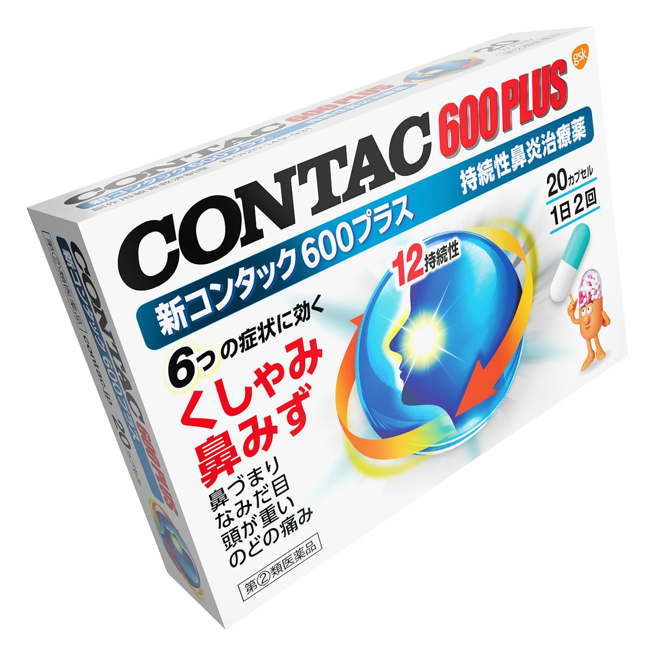
A three-dimensional metallic expression that gives a sense of functionality to the brand. We have brought about a change and evolution to the brand by maintaining the equity built up by Contac while going on the offensive with the expression.


The CONTAC® brand is highly recognized as a pharmaceutical brand effective in controlling and relieving various symptoms of cold, rhinitis, pollen, cough, and throat. BRAVIS has been in charge of design and development throughout the series.
For the renewal of the packaging of “New CONTAC® 600 Plus,” which is one of the most highly recognized products in the CONTAC® brand, we evolved the overall design into a three-dimensional, metallic expression. In addition, because there are strict restrictions on the efficacy and effectiveness that can be expressed on the packaging of pharmaceutical products, it is an important issue how to supplement the benefits that cannot be conveyed in words with graphics. The high efficacy and immediate effect are expressed with radial flashes, while the high sustainability is expressed with moving arrows.
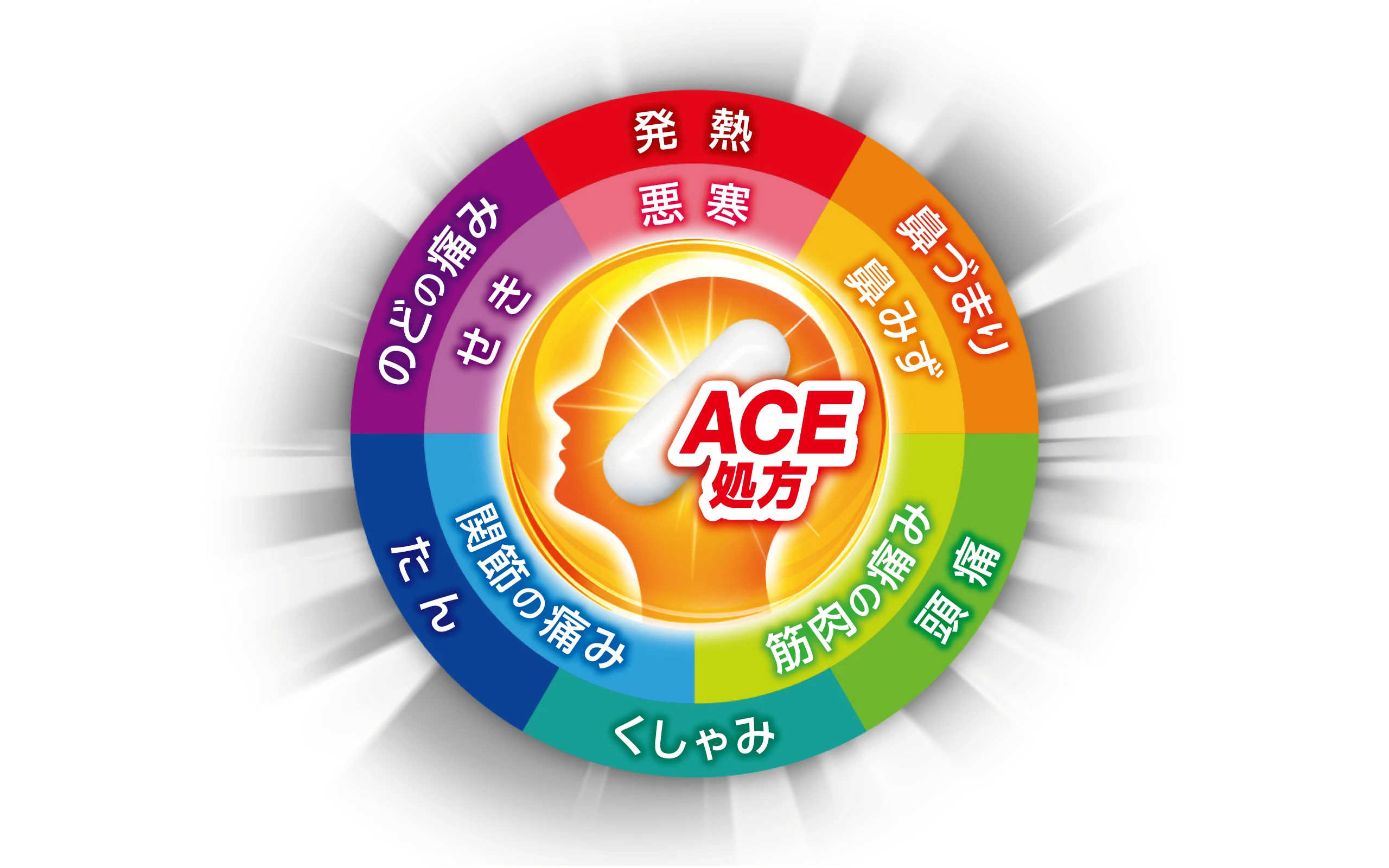
In the case of “New Contac General Cold Medicine Triple Shot,” a general cold medicine that treats a wide range of symptoms at the beginning of a cold, the face icon, which is the common graphic of the brand, is surrounded by 11 symptoms to express the product features that are effective in treating various symptoms. Unlike the existing Contac series, the upper band is copper-colored to give the product a face of a general cold remedy that can be kept in each household as a regular medicine. The brand’s position within the brand was reorganized as follows: Gold EX, Silver Sogo, and Copper Triple Shot.
- CLIENT
- GlaxoSmithKline Consumer Healthcare Japan
- SERVICE
- Package Design
- COUNTRY
- Japan
