
PROJECT


- Hakutsuru Sake Brewery
- Hakutsuru Maru
Design renewal of long-selling products
In 2015, Hakutsuru Maru underwent a renewal of its design, which we have kept for many years. In order to increase the number of new fans while continuing to gain the support of loyal drinkers, we reviewed the details of the design.
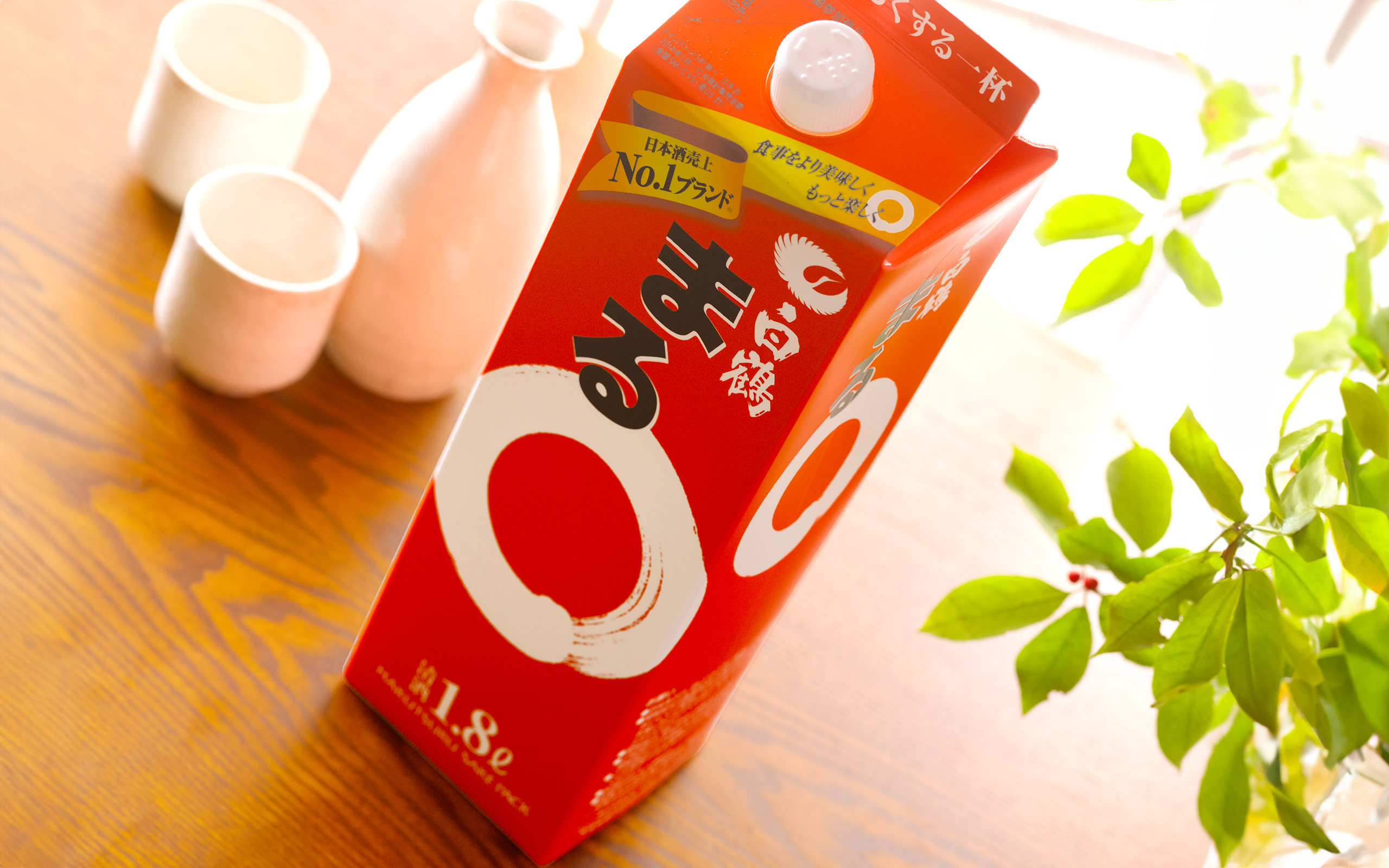
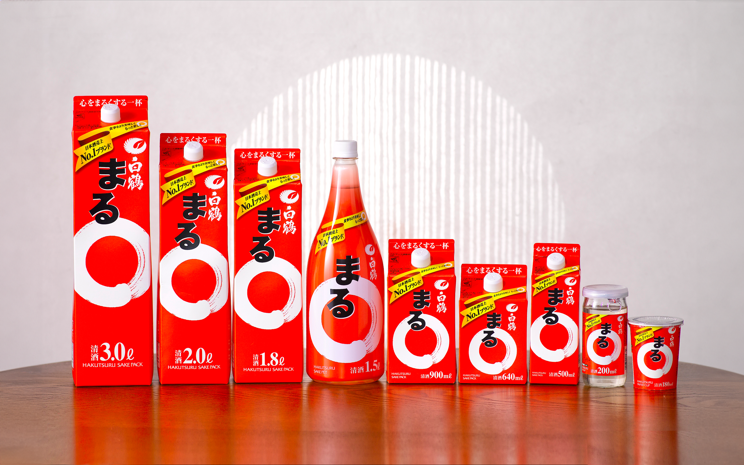
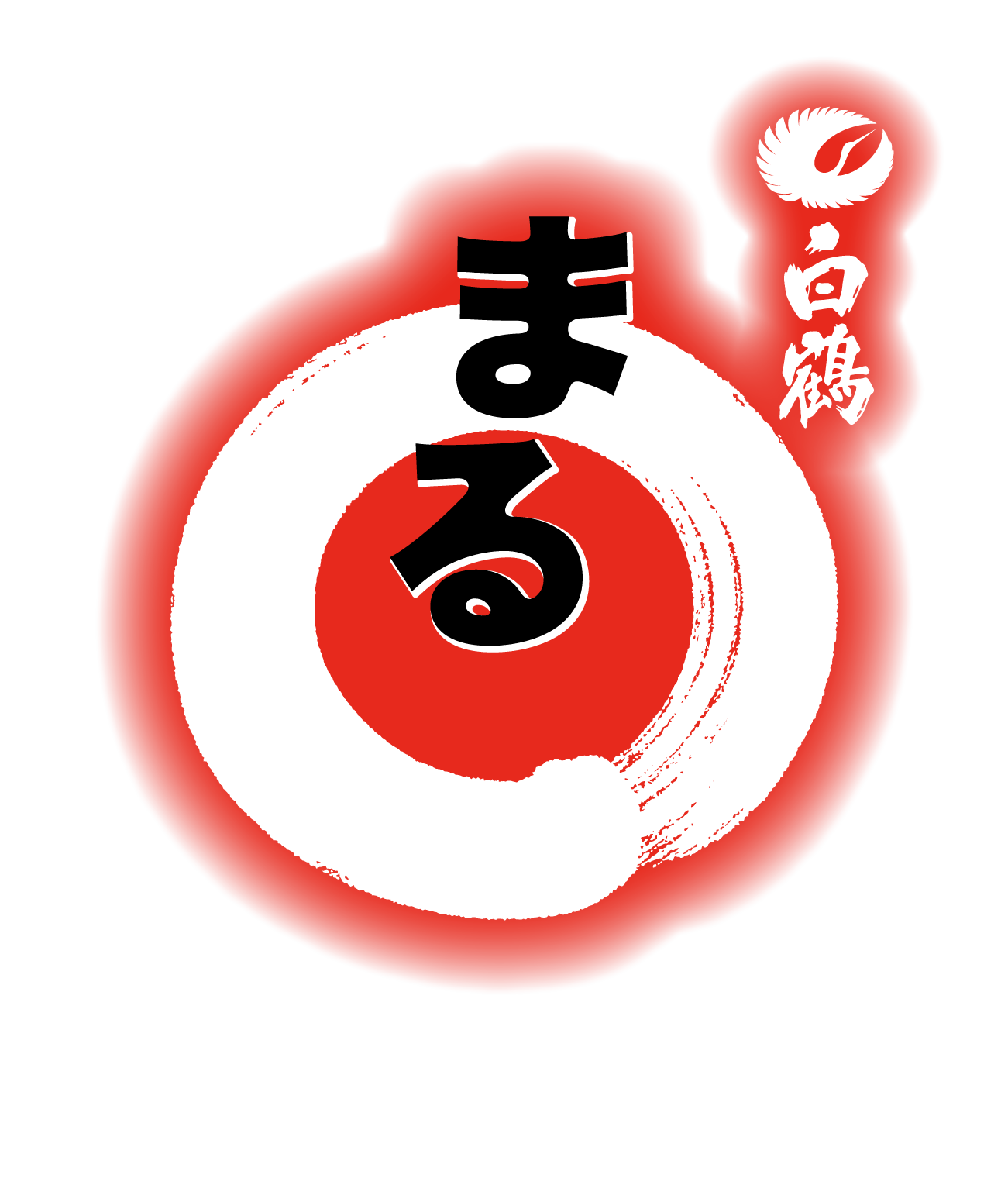
In keeping with its image color of red, the powerful white circle (maru) has been reincarnated as a more refined symbol of the Hakutsuru Maru, with a trajectory closer to that of a regular circle.
The “Maru” logo in black ink is connected to the circle by a white border, creating a unified and easy-to-see logo design. The yellow ribbon dancing lightly at the top of the front of the logo conveys the sales point of the product, and at the same time, it is an icon that intuitively conveys the deliciousness of the product, enhancing its appeal in stores.
Overall, the design is simple and modern, while retaining the world view of Maru.
- CLIENT
- Hakutsuru Sake Brewery
- SERVICE
- Brand Identity
- Package Design
- COUNTRY
- Japan