
PROJECT


- HOYA
- New
Identity Development
A New Century
HOYA, known as a manufacturer specializing in optical glass, has diversified its business based on its advanced optics technology and has developed its business in the information and telecommunications fields. As a global high-tech company that leads the electro-optics market, including photomasks for semiconductors, LCDs, and other computer-related products, HOYA sought a new corporate identity (CI).
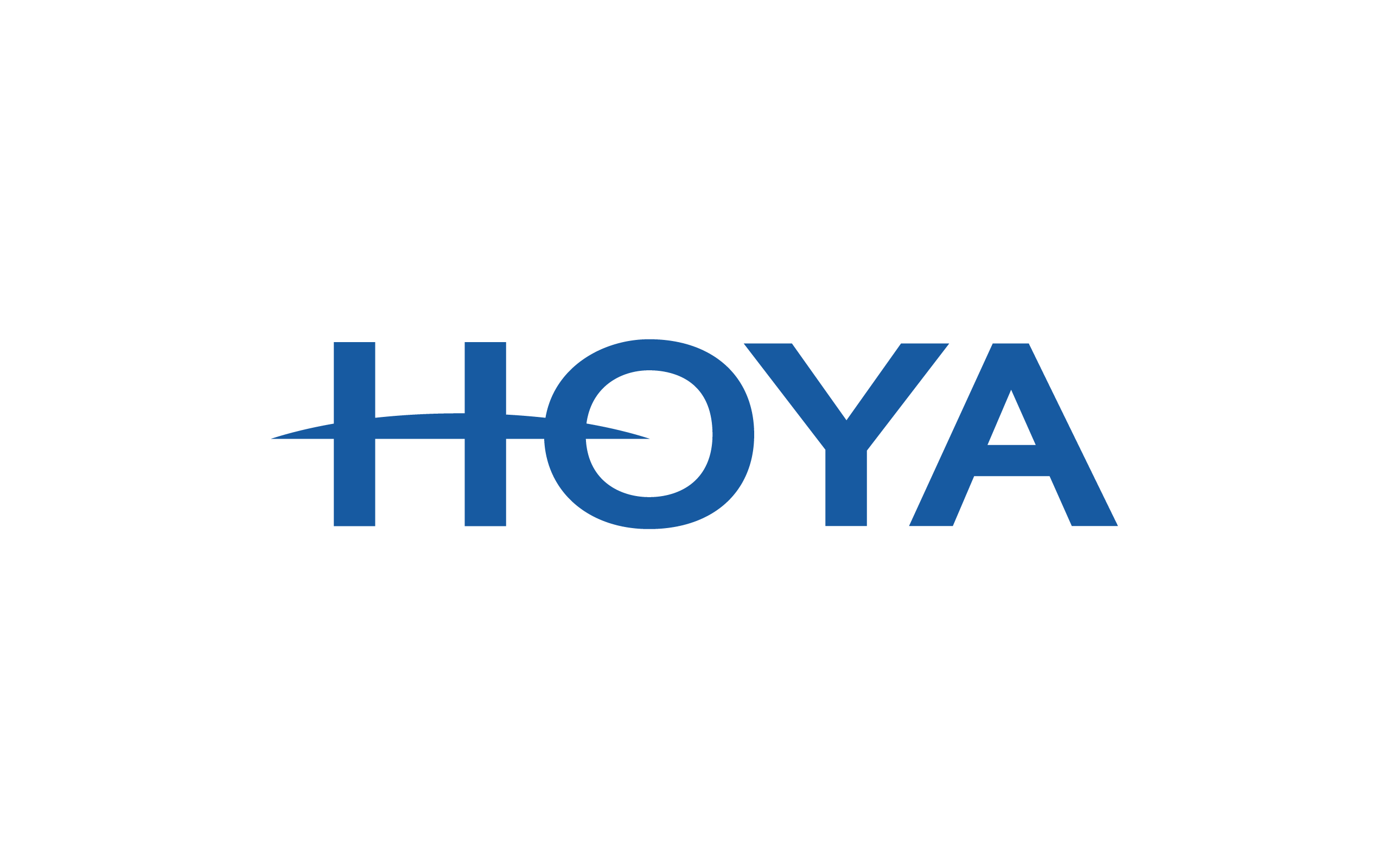
The new corporate identity created by Bravis features a global arc (a graphic arc extending to the left and right of the letter H). The soft arc, which represents HOYA as a worldwide company, evokes futurism, sophistication, technology, and human kindness. The sharp edges express HOYA’s corporate spirit and confidence as it moves into the 21st century. The well-balanced and solid typeface represents a reliable and professional company, and the brand color blue expresses technological strength and reliability.
Tetsuo Suzuki, President and CEO of HOYA Corporation, commented, “The HOYA Group symbol was established to create a brand that symbolizes the HOYA Group and a corporate brand that will serve as the centripetal force of the Group’s management. The HOYA Group will continue to develop and expand its business globally and into a new era. The HOYA Group has established a group symbol with the aim of building a corporate brand.
- CLIENT
- HOYA
- SERVICE
- Application Design
- Brand Management Manual
- Corporate Identity
- Design System
- COUNTRY
- Japan