

PROJECT


- Kellogg's Japan
- Kellogg's.
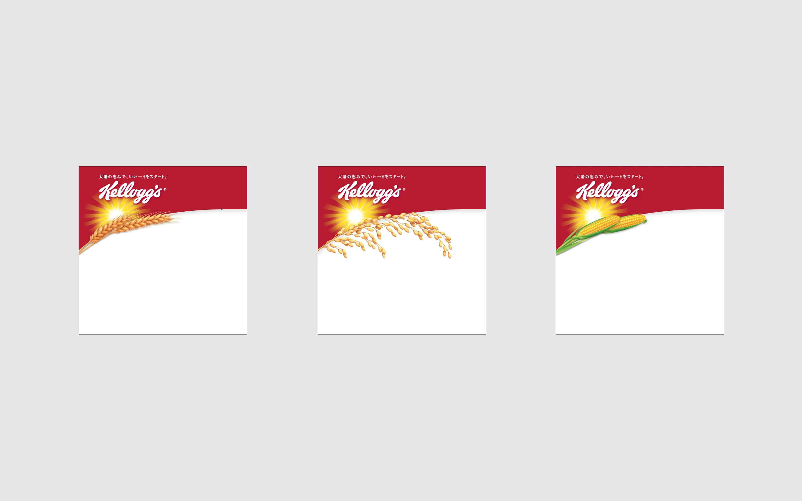
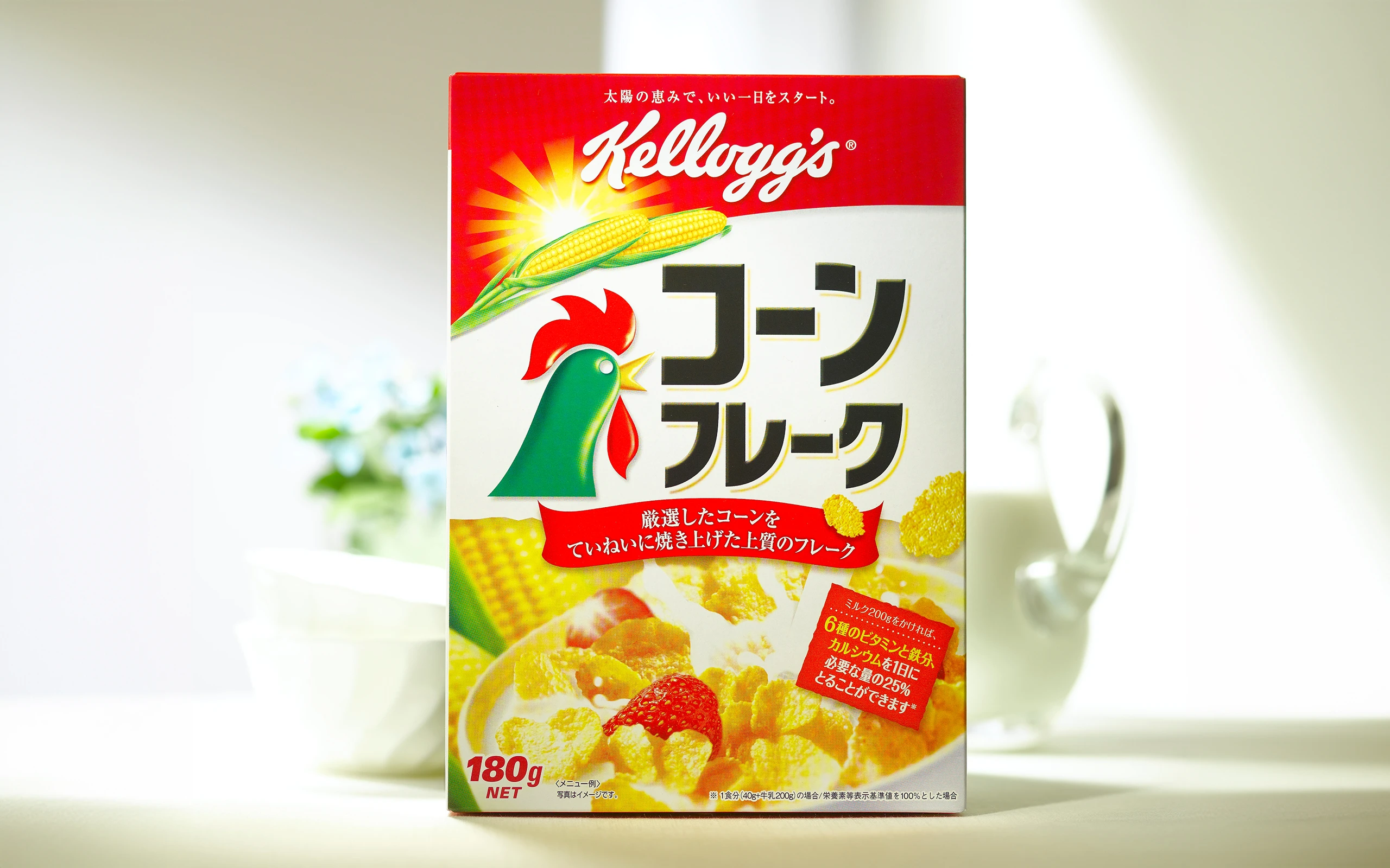
Strengthen brand presence in stores with a design system.
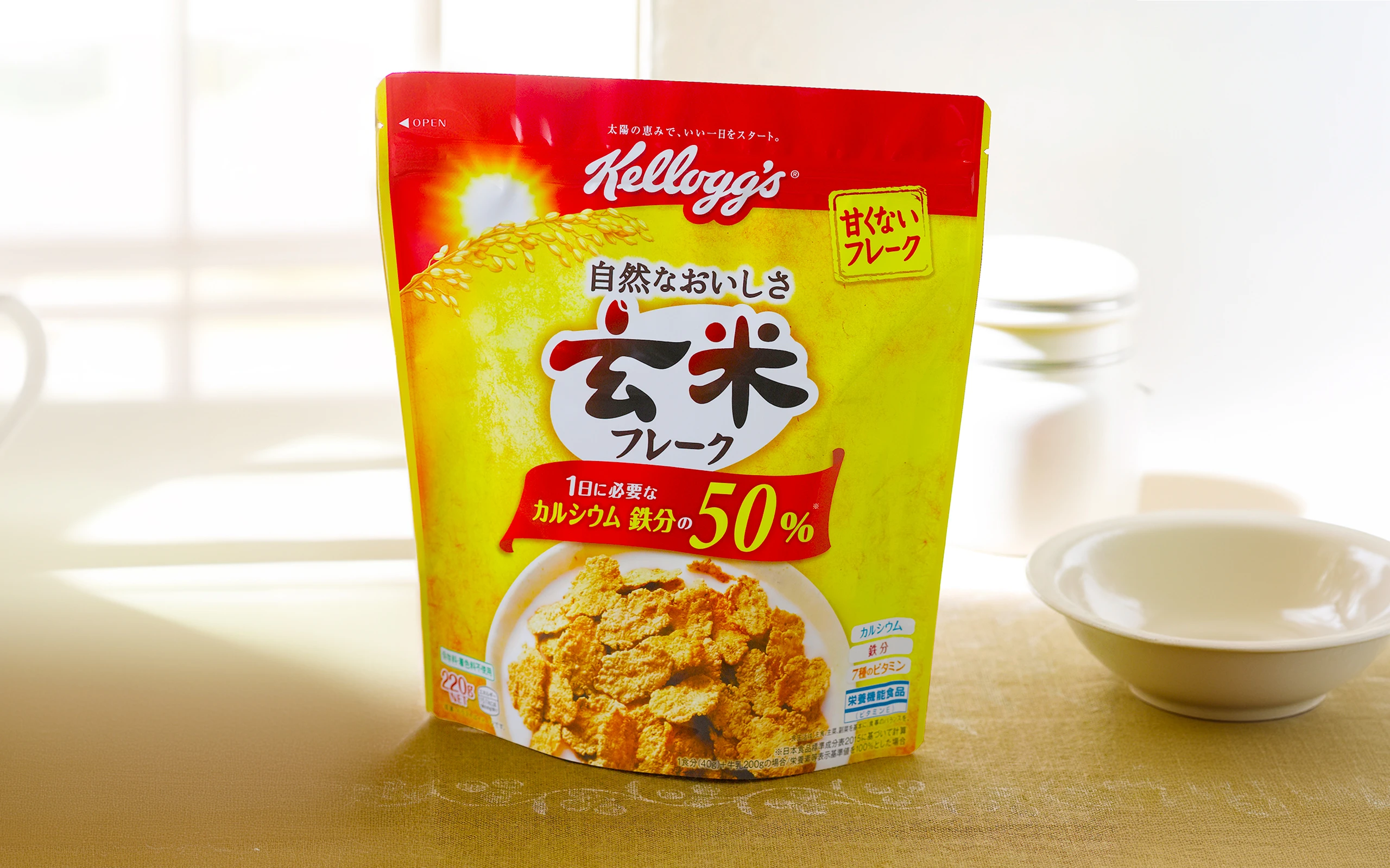
While taking advantage of the “Kellogg’s” design system that takes face value in stores, we developed a design that also expresses a series feel. The brand was revitalized with packaging that secured both the world view of “Kellogg’s” and the appeal of individual products.

In response to the growing market demand for sugar-free products, Kellogg’s Japan decided to produce its first ever vitamin-containing granola, “1-Day Multi-Vitamin Granola,” and to develop the “Body Support” series together with the company’s Soy Protein Granola.
Following the red band at the top of the package common to Kellogg’s products, the “Body Support” series has a family feel by creating commonalities in the “Body Support” series, such as the oval surrounding the product name and the natural ingredients it contains throughout the package.
The nutritional icons are connected by an oval, and the gradation of vitamin colors enhances the sense of functionality, while the natural feel of the kraft paper background and warm colors express the deliciousness of the product. We have created a package with a sense of effectiveness and glamour that will be appreciated by busy women who want to easily supplement nutrients that they tend to lack.
- CLIENT
- Kellogg's Japan
- SERVICE
- Design System
- Package Design
- COUNTRY
- Japan
