
PROJECT


- Nestlé Japan
- Kit Kat Series
Contributing to a sustainable society, just like a brand.
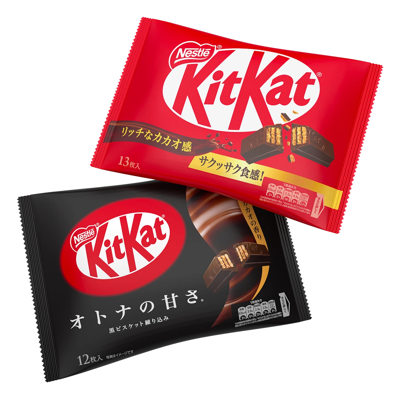
KitKat” is a paper package that uses an outer bag to solve the problem of plastic waste. Contributing to a sustainable society was done with a world view that is unique to “KitKat,” a long-selling brand.
KitKat” is a chocolate brand that continues to be loved in more than 100 countries and regions around the world. The brand had the brand’s purport of “supporting people who work hard” by encouraging consumers to share their daily tweets with each other on SNS through hashtags such as “I’m sure I will win” for students preparing for exams and “#Hey Kit Kat” to sympathize and cheer each other on.
The hashtag “#Nei Kit Kat” was posted by many people who were busy with their daily chores and other daily life styles that have changed with the spread of the new coronavirus, and many of them expressed their sympathy with the postings. Therefore, we developed “Kit Kat Masked Almond & Cranberry,” which embodies our desire to be close to people’s voices through Kit Kat, which is to support people who work hard, and to help them enjoy the few moments they have in their stressful daily lives. Strategy & Consulting Division and the creative team were in charge of the naming, design concept, and package design development.
In developing this brand, the design concept was defined based on an analysis from the consumer’s perspective of how they spend their own private time and how it makes them feel good, in response to the shift in the target’s overall consumption trend toward imitative consumption, where they choose brands that express their own lifestyles. Based on this trend, the design concept was created by depicting a scene from the daily lives of the main target women with hand-drawn illustrations, appealing to the fact that the items are theirs, and full of emotion to help them relax for a short while. The design is full of emotion and appealing to the women who are the main target audience.
In the name development process, we proposed more than 50 names that, like the packaging, express that the product is theirs, and decided on “Gap Jikan no Almond & Cranberry,” which conveys the scene of eating the product, the emotional feeling, and the product’s characteristics. The message and scenes that the target audience can relate to and smile at are designed not only on the outer packaging but also on the individual packages, expressing that the product is an accompaniment to the brand name “Gap Jikan no Almonds & Cranberries”.
This is the birth of a new Kit Kat full of emotion that will be a reward for many people, appealing to the fact that it is there for consumers to relieve their daily fatigue.
- CLIENT
- Nestlé Japan
- SERVICE
- Design Concept
- Package Design
- Product Copy
- COUNTRY
- Japan
