
PROJECT


- Kagome
- Yasai Ichiniti
Kore Ippon(Ippai)
A long-selling brand that changes with the times.
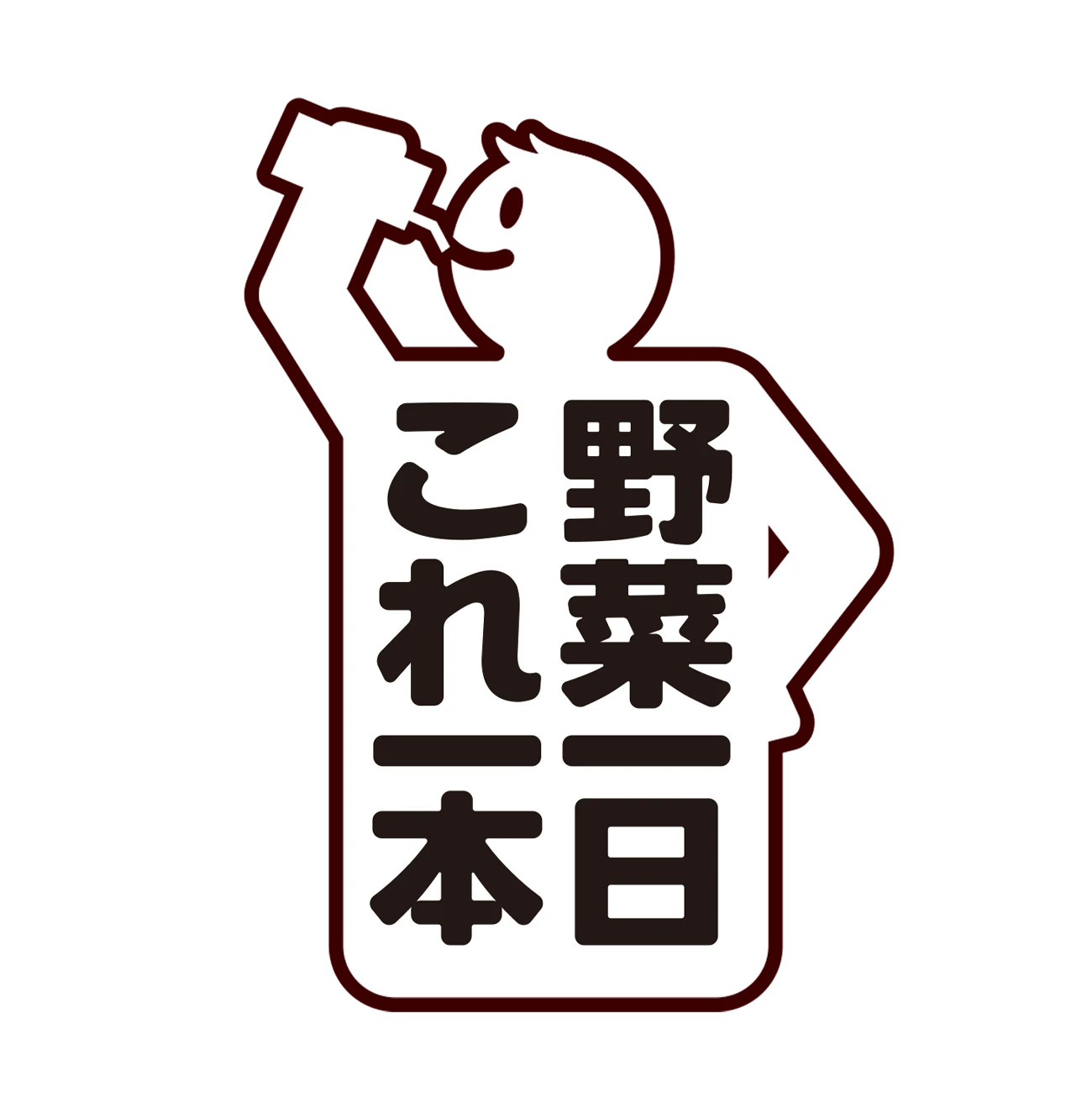
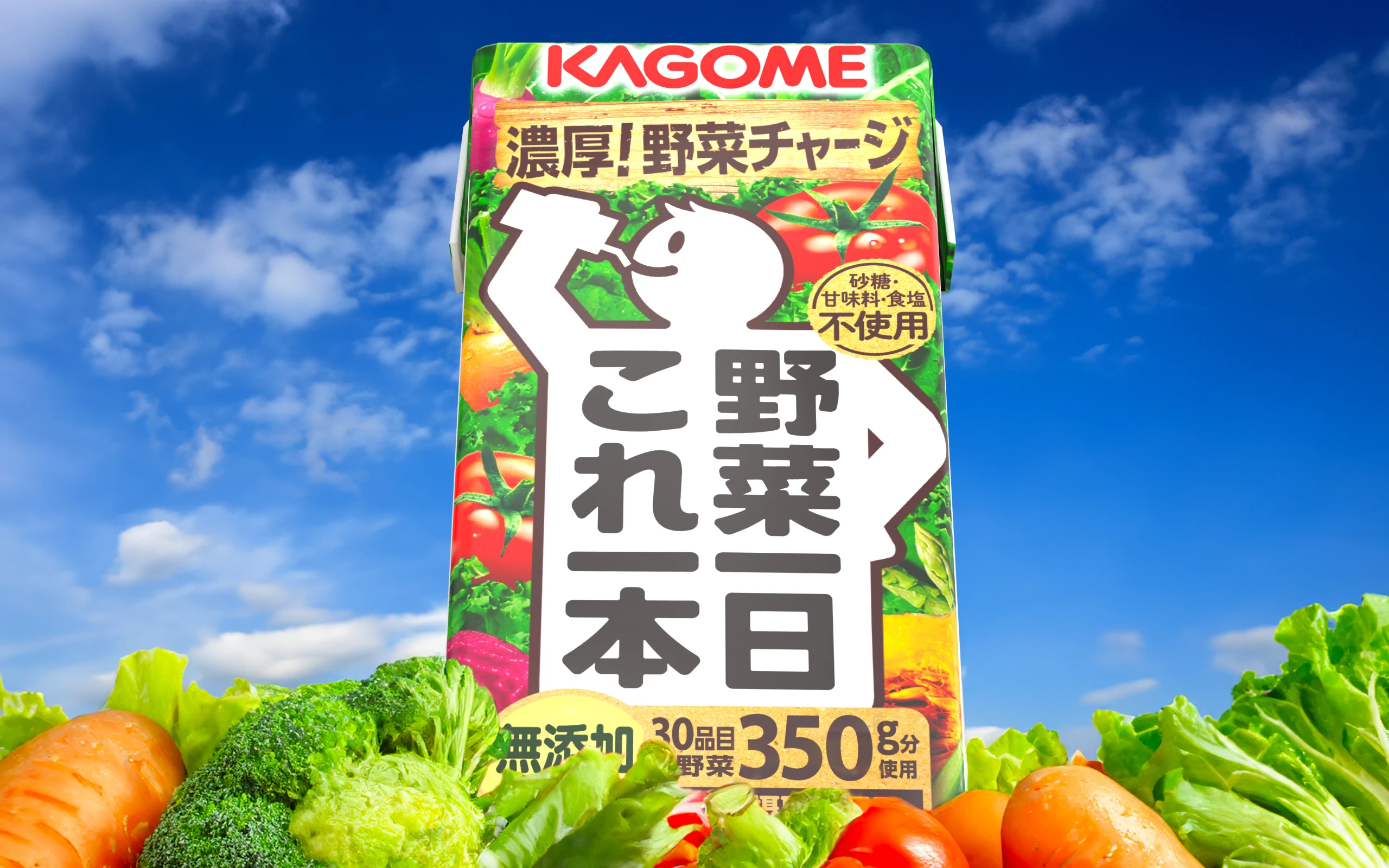
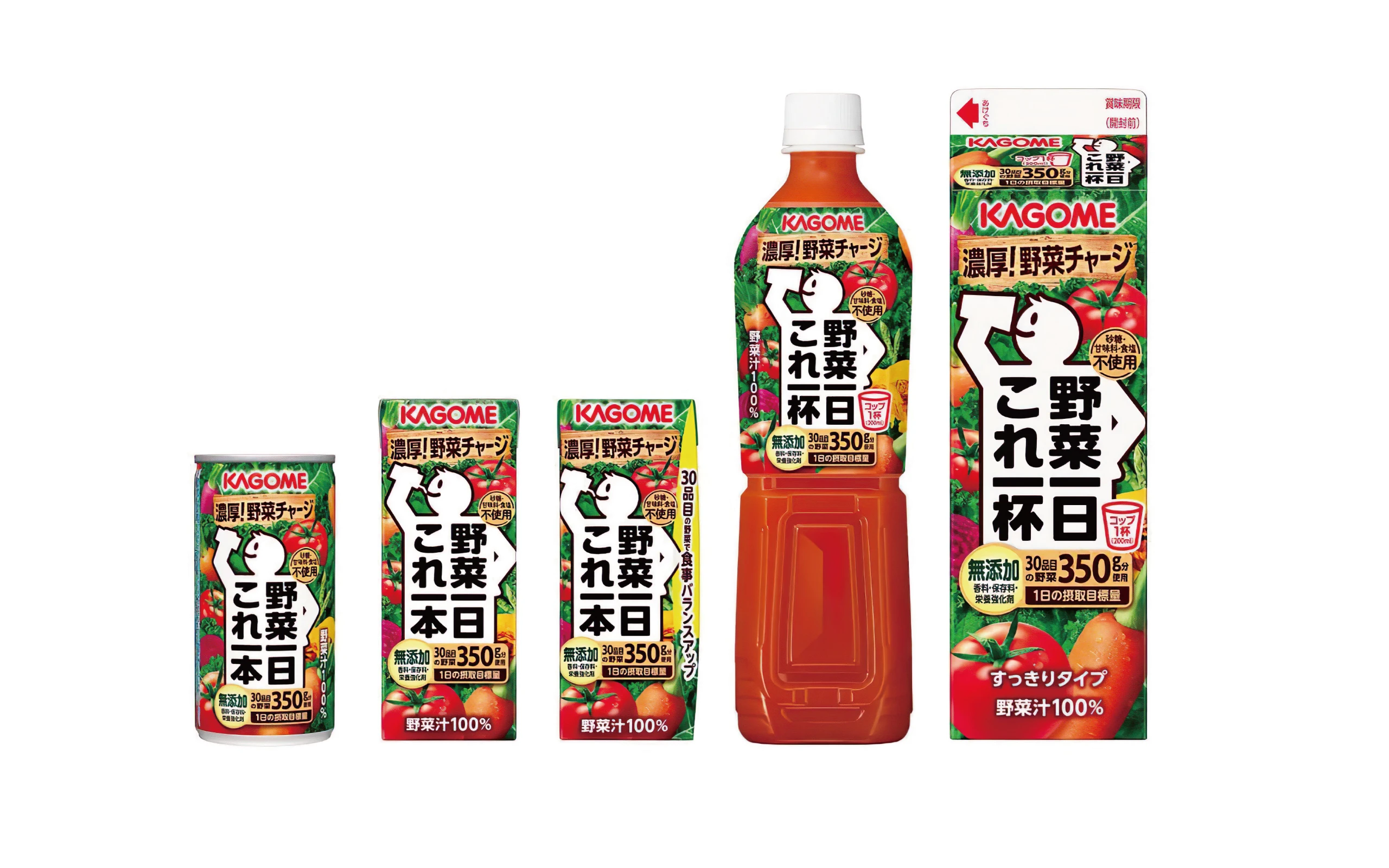
With its white silhouette of a person and panels that highlight the efficacy of the product, “Vegetable 1 Day This One Bottle” makes a strong impact on store shelves. Aiming to become the No. 1 brand in the vegetable juice category, we developed a package design that combines the world view of the product with a sense of functionality.


Kagome is a leading processed tomato food company and a top manufacturer of vegetable juice. Vegetable Ichinichi Koreichibon” is a vegetable juice that provides the daily requirement of 350g of vegetables in a single bottle, made from 30 kinds of vegetables with a focus on taste and nutrition, utilizing the concentration technology that is Kagome’s forte. Braavis has been developing the packaging design of the “Vegetable A Day, This One Bottle” brand since its launch many years ago. In addition to the core product, we have also designed the packaging for other products in the series, including “Vegetable A Day This One Bottle Light,” which contains 50% less sugar, “Vegetable A Day This One Bottle Plus,” a functional food, and “Morning Fruit This One Bottle.
In the package design of the core products, the white silhouette of a person, which has become the brand’s equity, was reinforced on the edges so that it would stand out clearly on store shelves. The silhouette of the person is also designed to look as if he or she is gulping down the product, with his or her hands on the hips and a rounded font for the logo to make the product more familiar and endearing to more people. In addition, the vegetables in the background are arranged so that their respective colors stand out, and the design appropriately appeals to a sense of freshness and healthy image in various capacities, materials, and shapes.
Vegetable Ichinichi Koreichibon Plus”, the brand’s first food with a functional claim, has added the claim of “suppressing the absorption of sugar and suppressing the rise in blood sugar levels after meals” and “lowering elevated blood pressure”, The product will be relaunched in January 2022. The package design was designed to make the brand name and added value appear as a single unit, effectively promoting the added value of the functional food label.
The design also conveys a sense of effectiveness, with a more dignified silhouette of a human figure than the core product and a panel that clearly shows the two functions of the product. The use of gold as a color accent also expresses a sense of specialness and high functionality within the series.
In addition, a potage product will be introduced in 2023. While expressing the fact that the product contains a lot of vegetables, which is typical of the brand, a cockscomb hat is placed on Koreichi-kun to create a sense of specialness while maintaining the brand’s world view.
- CLIENT
- Kagome
- SERVICE
- Brand Identity
- Package Design
- COUNTRY
- Japan
