PROJECT


- ROHTO Pharmaceutical
- Pansilon Active 55
A design strategy to bond with seniors.
The design and copy, using age numbers as a hook, appealed directly to the target audience. The brand was successful in attracting new users while maintaining the “Pansilon” brand concept.


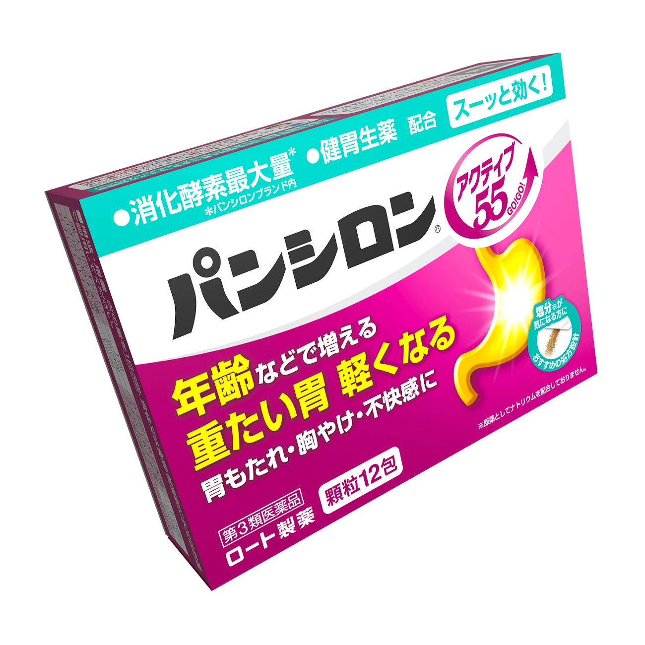
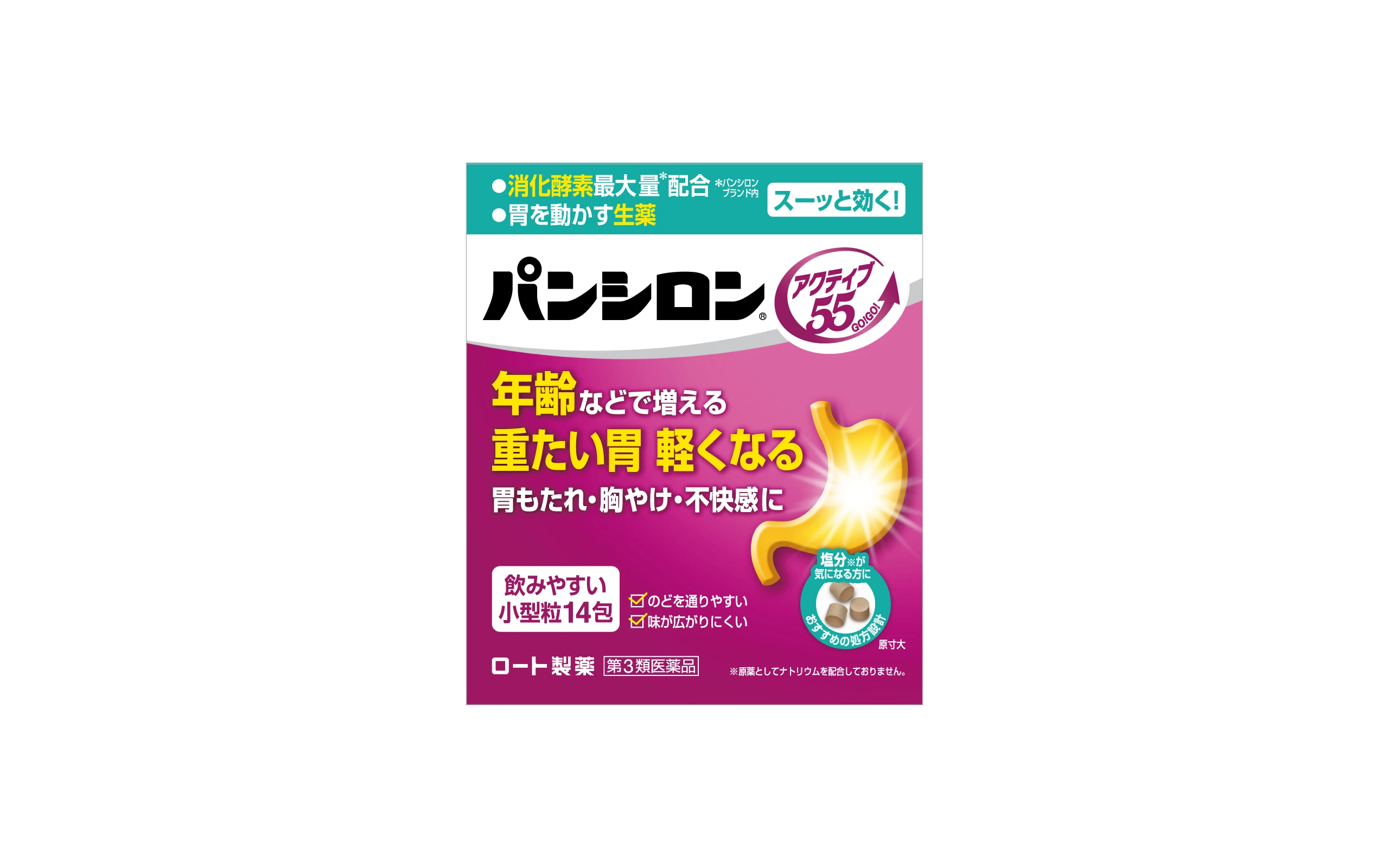
Pansilon is the only gastrointestinal drug brand with a lineup for each gastric symptom. Although Pansilon had gained support from a wide range of age groups by developing products that answered various concerns, there was no lineup that answered the needs of people in their 60s and older, the volume zone in the gastrointestinal drug category. In response, we launched a new product, “Pansilon Active 55,” which relieves the feeling of lethargy that comes with aging and makes people feel active. Braavis was in charge of design development.
The important points in developing the package design for this brand were:
・Design with the main target of people in their late 50s in mind ・Conscious of the face of the Pancilon brand ・Attract a sense of effectiveness at a glance
The key points of the development were as follows.
Purple was used as the main color to emphasize the high effectiveness of the product while keeping the main target in mind. The coloring was chosen so that the target audience would think the brand was theirs by showing it in its entirety. The design format used for the Pansyron brand, with the effect and brand name at the top, and the functional copy and stomach icon at the bottom, was designed to create a sense of unity when placed side by side.
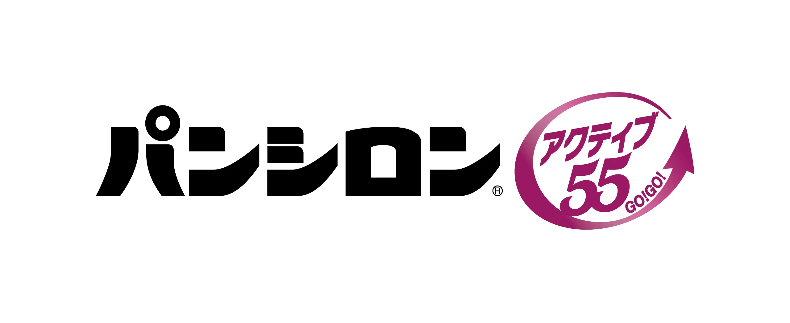
In order to make the sense of effectiveness more appealing, the brand name icon was created with an arrow with the sub-copy “GO! The design retains a sense of unity as a brand, yet has a sense of appearance that will attract a new customer base.
- CLIENT
- ROHTO Pharmaceutical
- SERVICE
- Package Design
- COUNTRY
- Japan
