REPORTS
Group Brand Logo Renewal: Determining What Elements to Protect and What Elements to Evolve

The Dilemma of Evolution and Constancy
With the rise of startups and the entry of companies from other industries, the market environment surrounding companies is changing dramatically in proportion to the evolution of technology. Anyone involved in branding will agree that stock assets such as corporate logos, slogans, and visions need to evolve to match the times.
However, there is a contradiction between flexible updating to survive in turbulent times and maintaining stock assets created based on the founding philosophy and long-term strategy. This is the eternal dilemma of corporate branding. This is the eternal challenge of corporate branding, but can a new idea or strategic approach provide a solution?
The SHIONOGI Group, for whom we provided branding support, may be one answer to this question.
A New Story for the Inherited Logo
The SHIONOGI Group, which has supported Japan’s pharmaceutical industry for more than
140 years, has always developed its business in line with the changing times. The SHIONOGI Group’s vision for 2030 is to “create the future of healthcare on a new platform” and to achieve bold growth that goes beyond drug discovery. To achieve this ambitious vision, the brand needed to evolve as well.
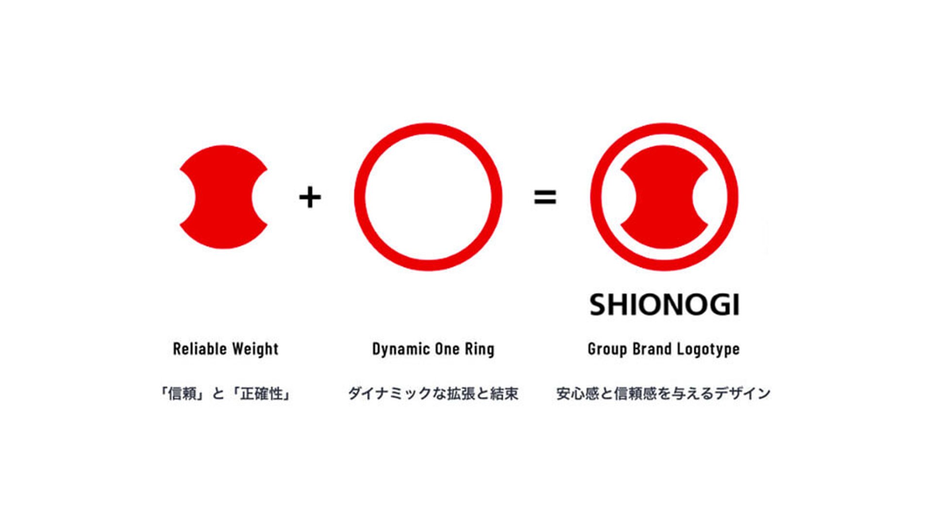
On the other hand, there are some things that have remained forever unchanged throughout our history and should not be changed. These are the basic policy that we have always adhered to: “SHIONOGI will always provide the best medicine necessary to protect people’s health,” and the weight mark that we have carried as the Group brand logo. This mark, which is based on a weight used to measure the amount of medicine in a balance, is a symbol of “accuracy,” “honesty,” and “trust” and is the very spirit of SHIONOGI. The SHIONOGI Group’s branding also confronts these conflicting issues: the changes necessary for evolution and the unchanging elements that must be preserved as part of its identity. However, by clarifying the role of the weight mark and the rules for its use, and by adding a new story to the graphic elements that comprise it, we were able to break out of this situation.
Re-establishment of the role and rules of use of the brand logo
The weight mark was originally defined and used as the brand logo of Shionogi. In reality, however, it was widely used, including by group companies, and there was a gap between the definition and the actual situation. There are many similar cases in well-established companies that have been in business activities for many years.
Although the role of a brand logo and its definition cannot be easily changed in principle, SHIONOGI took this opportunity to examine to what extent the use of the weight mark was appropriate for its group companies, thereby realizing more effective group branding. When renewing a brand logo, it is naturally important to update the design expression and examine the meaning of the design, but the basic premise is to “clarify the roles and rules of use. By strategically carrying out this process, branding can be executed more smoothly, and the branding can then be spread throughout the market.

Expressing the corporate vision with existing elements
In terms of visuals, it was the client’s strong desire to maintain the symbolic weight mark, so instead of a major renewal, a strategic refinement was made. Specifically, we adjusted the spacing and shape of the weight mark, its outer edge, and the SHIONOGI logotype to give it a sophisticated, modern feel. This resulted in an updated design that allows the SHIONOGI Group to communicate in a unified manner across a variety of channels without compromising the trustworthiness of the SHIONOGI Group it has cultivated.
The rebranding also placed emphasis on the meaning behind the graphic elements that make up the weight mark. Particular attention was paid to the outer rim. Until now, this element has had no meaning or name, but we have newly named it the “Dynamic One Ring.” By incorporating the story of “the SHIONOGI Group and its stakeholders becoming one and expanding dynamically,” we have sublimated it into a design that all SHIONOGI employees can talk about and be proud of. The “Dynamic One Ring” is also used as a sub-graphic in various applications, and has become an important element in strengthening the brand expression.
After this rebranding, SHIONOGI has taken the helm for further growth, and is actively communicating its new vision and the aspirations contained in its brand logo outside the company. In the future, it will be important to disseminate this information within the company, and we have also created a brand book as a core tool for this purpose. The brand book is used as a starting tool for understanding the brand by carefully and sensitively conveying the thoughts and meanings behind the brand.
A company with a long history is not a company that cannot be changed or rebranded. By considering the elements that need to be protected and those that need to evolve, and by implementing strategic branding, it is possible to propel a company to a new stage of growth.