- - Brand concept development
- - Brand naming development
- - Product copy
- - Package design development
Leading to a tomorrow full of body and mind
Meiji Corporation’s “Meiji Meibalance” is a nutritional food brand with the No. 1 track record in the medical field.
Since the brand was launched in 1995, the lineup has been developed to meet the needs of pathological conditions and the medical field, and in 2014, “Meiji Meibalance Mini Cup” were launched for over-the-counter use, which can be purchased at drugstores and other stores. The brand has long supported the lives of people who have difficulty getting enough energy and nutrients from their diets, as it tastes great and provides a high energy intake in a small amount, as well as a well-balanced blend of the six major nutrients.
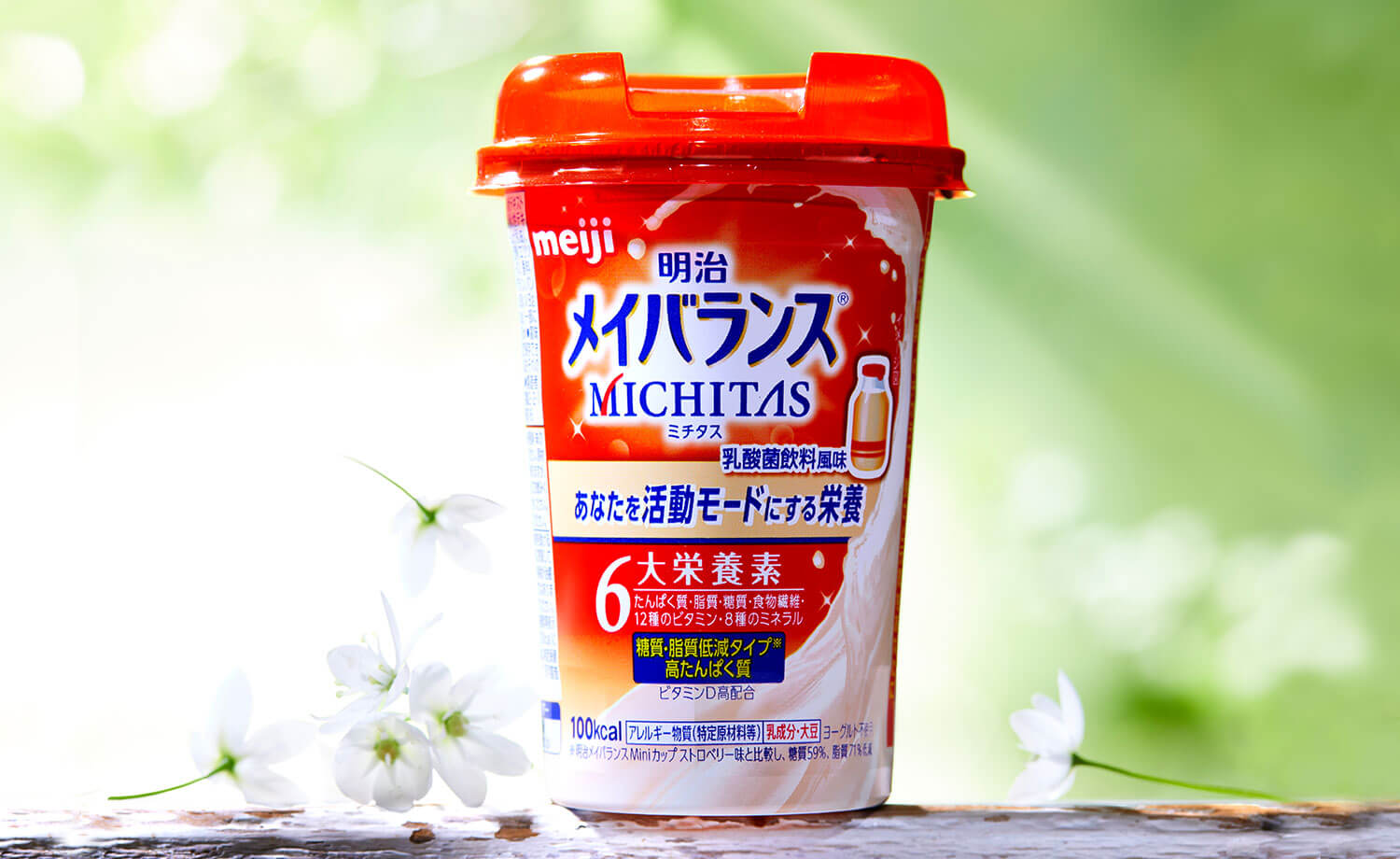
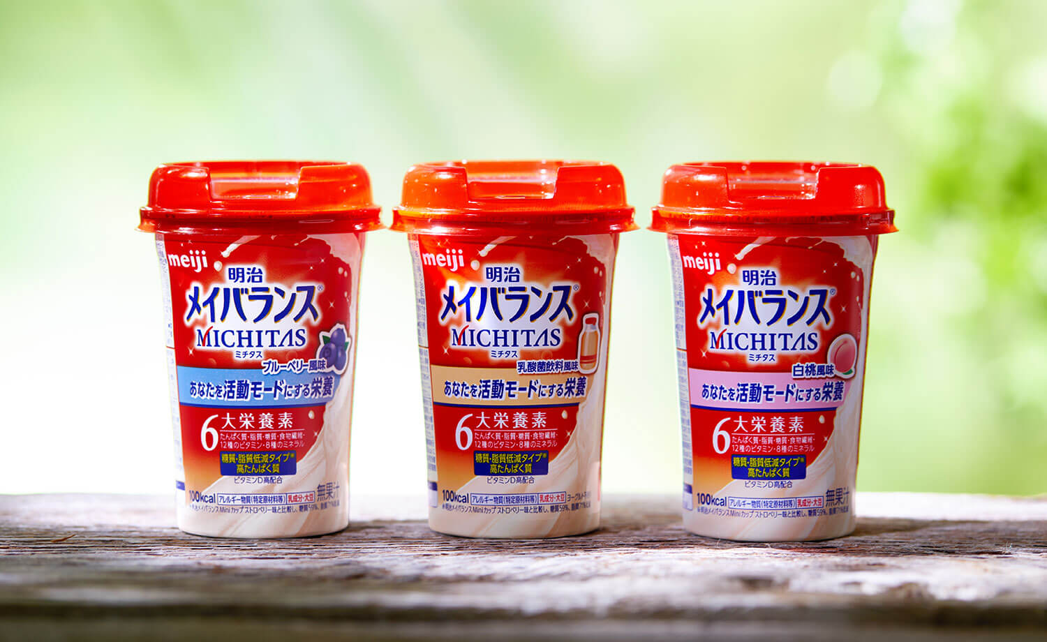
“Meiji Meibalance” has launched a new brand “Meiji Meibalance MICHITAS” to answer the desire to “always be healthy and radiant” in the age of 100 years of life in Japan. BRAVIS was in charge of concept development, naming, product copy, and package design.
While “Meiji Meibalance Mini Cup” targets people who have difficulty getting enough energy and nutrients from their diet, this brand targets people who are eating well but are concerned about imbalanced nutrition and want to be more active in their daily lives. The brand targets people who are eating well but are concerned about imbalanced nutrition and want to be more active. For this reason, “Meiji Meibalance MICHITAS” has a reduced sugar and fat content while retaining the nutritional design of “Meiji Meibalance” which contains a well-balanced blend of the six major nutrients. In addition, by creating a more refreshing taste, we have achieved a delicious taste and nutritional balance that can be consumed in accordance with one’s everyday diet.
Based on these product features and target thoughts, the Strategy & Consulting Division developed several concepts. Once the concepts were determined, we developed the naming and product copy to match the concepts. After developing more than 200 ideas, the name “MICHITAS” was adopted to express the company’s desire to support a “full tomorrow (MICHITAAS)” for both body and mind.
The package design uses dynamic liquid sizzles and graphics to create an active, positive image, while the flowing sizzle expresses a sense of deliciousness at first glance. Furthermore, while the “Meiji Meibalance Mini Cup” package is dark blue and white, the brand color for this brand is red with a sense of vitality to embody the concept while ensuring visibility in stores and differentiation from the “Meiji Meibalance Mini Cup. The brand is also designed to be easily recognizable in stores.
The new brand supports people who are active in their daily lives with the power of the six major nutrients.