- - Package design development
Potato chips with strong presence
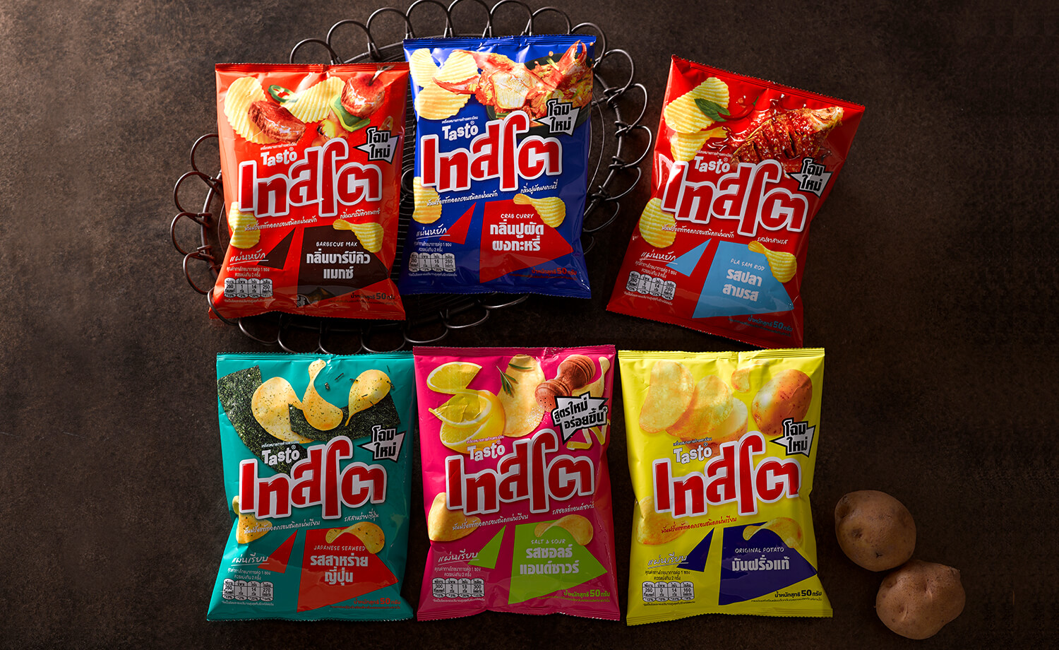
In recent years, competition in the Thai potato chips market has intensified as more and more foreign brands have entered the market, and more brands are offering a wide range of series and flavors.
The Thai potato chips brand Tasto is a major brand, competing for the first and second place in sales in Thailand. It has a particularly strong flavor that Thai people prefer, and has been loved by both children and adults for many years.
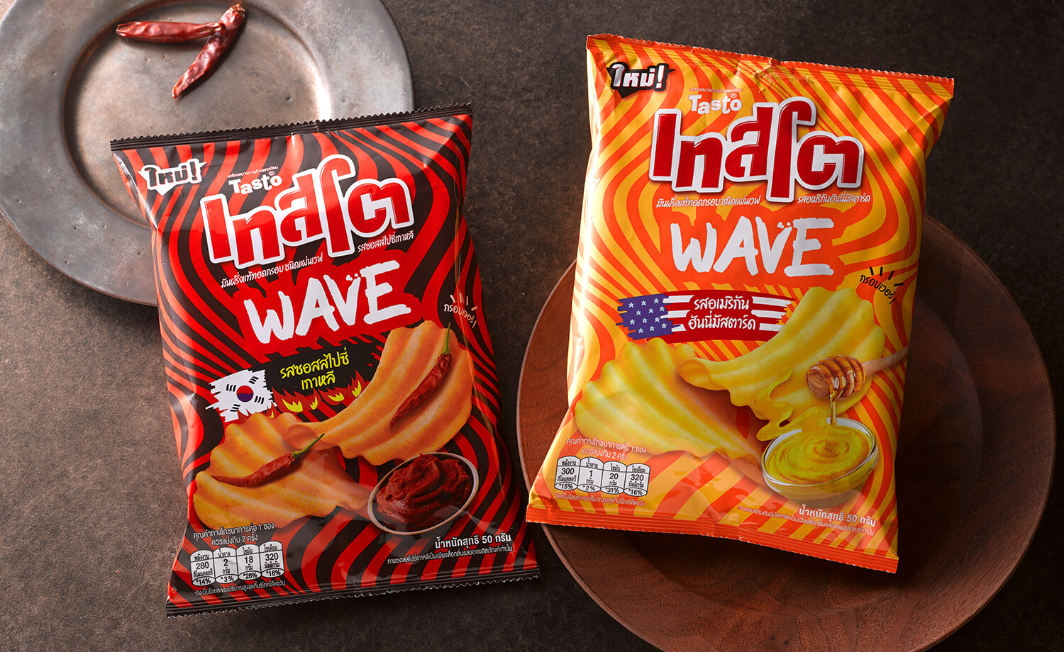
As the name suggests, the Tasto brand’s “Wave” series is different from regular potato chips in that it is characterized by its wave shape. The newest addition to the WAVE series is the Tasto WAVE, which has a deeper and wider wave shape than the “Tasto Super wavy” already on the market. Compared to the “Tasto Super wavy,” the “Tasto WAVE” is not only more satisfying, but also more light and comfortable to eat due to its thinner shape. We were in charge of the package design for “Tasto WAVE,” which has a unique shape that catches the eye.
We designed a distinctive wave-like graphic in the background to relate to the product features and help people understand at a glance that it is Tasto’s WAVE. The wave graphic is also fun and makes the younger generation, the target audience, want to pick up the product naturally, and combined with the sizzle of the potato chips, which firmly reveals the wave shape, the design succeeds in strongly promoting the product features.
There are two flavors, “Honey Mustard” and “Spicy Sauce,” and the flags of the countries represented in each flavor are represented by brushstrokes to express the intensity of the flavor. The two-tone colors and the sizzle of the potato chips naturally draw the eye to the design, even in the potato chip section where many colorful products line the shelves.