- - Corporate identity development
Become the No. 1 Comprehensive Developer in the Chubu Region
On April 1, 2022, the Real Estate Business Division of Nagoya Railroad Co., Ltd. and Meitetsu Real Estate Co., Ltd. will merge to form a new urban development company, Meitetsu City Development Corporation (English name: MEITETSU CITY DESIGN CO.,LTD.). For this memorable occasion, BRAVIS was in charge of developing a corporate brand mark for the new company.
Prior to the merger, both companies belonged to the Meitetsu Group. Nagoya Railroad Co., Ltd. was engaged in residential development, leasing, and other businesses along the Nagoya railroad line, while Meitetsu Real Estate Co. Based on the wealth of knowledge and experience that each company has accumulated in Nagoya, as well as the trust they have built up over the years with their customers, they have now taken a new step forward as a comprehensive developer by integrating into Meitetsu Urban Development Corporation.
Meitetsu Urban Development Corporation is an “urban development” company that creates the attractiveness of the Nagoya area by evolving a wide range of businesses, including not only the real estate business of leasing and condominium sales, but also hotel development and commercial development, which form the foundation of urban development.
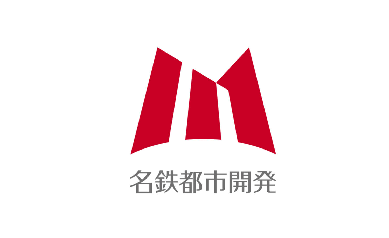
Based on the above, BRAVIS developed a corporate brand mark through various interviews. Dozens of proposals were developed, and after much discussion, the corporate brand mark that was finally selected was a striking red color with three pillars in the shape of an “M” for “Meitetsu Urban Development.
As an urban development company, the corporate stance of improving the value of the community is expressed in the pillars, which evoke the image of a building and a town. The passionate aspiration is also expressed in the passionate scarlet red color.
The gently curving lines at the bottom are reminiscent of the horizon and the earth, and appeal to a sense of corporate stability. The upward growth symbolizes the growth of the region and the company’s will to continue to take on challenges and grow. The pillar on the right represents the “1” in the company’s declaration of “No. 1 in the Chubu Region,” and is an equity element in the mark. Throughout, the corporate brand mark is stylish, yet conveys a sense of scale and anticipation.
The mark is currently used symbolically in a variety of locations and plays a part in creating the image of Meitetsu Urban Development Corporation.