- - Package design development
Creating a New Standard in Souvenirs
When traveling or on a business trip, you are bound to visit a souvenir shop. GrapeStone, which operates a number of well-known confectionery brands that anyone who has visited a souvenir shop in the Kanto region has seen at least once, was planning a new souvenir product using potatoes as an ingredient. Bravis was contacted for ideas on how to create a unique brand that would be the consumer’s choice in the fast-paced market of fashionable, high-quality new souvenir brands.
What GrapeStone developed in collaboration with a major confectionery company was an evolutionary snack that upgraded the standard snack, potato chips, with its unique manufacturing technology. It was planned to be released in time for the grand opening of Gransta Tokyo, a commercial facility located inside Tokyo Station, and it was easy to imagine that the area would be crowded with fashionable new souvenirs that each company was proud to offer. Therefore, we developed a concept and naming that could be used for everything from packaging to storefront images, staff uniforms, booklets, and websites to give the brand strong equity and make consumers want to buy it. We developed a strategy to create a brand that would make consumers want to buy.
Several consultants brought their ideas together to develop the concept and naming for the new brand. The key points were that the name should be highly compatible with the concept of Gransta Tokyo, that it should not be buried in the souvenir market, where new brands are appearing one after another, and that it should take advantage of the characteristics of the new product. Discussions were held from each consultant’s point of view, and the concept and naming were developed repeatedly. A wide range of directions were proposed from various perspectives, including ideas tied to the regional characteristics of the Kanto region and its long history, and ideas strongly related to the characteristics of the new product. After several discussions, an idea that reflected the client’s abundance of imagination was finally adopted.
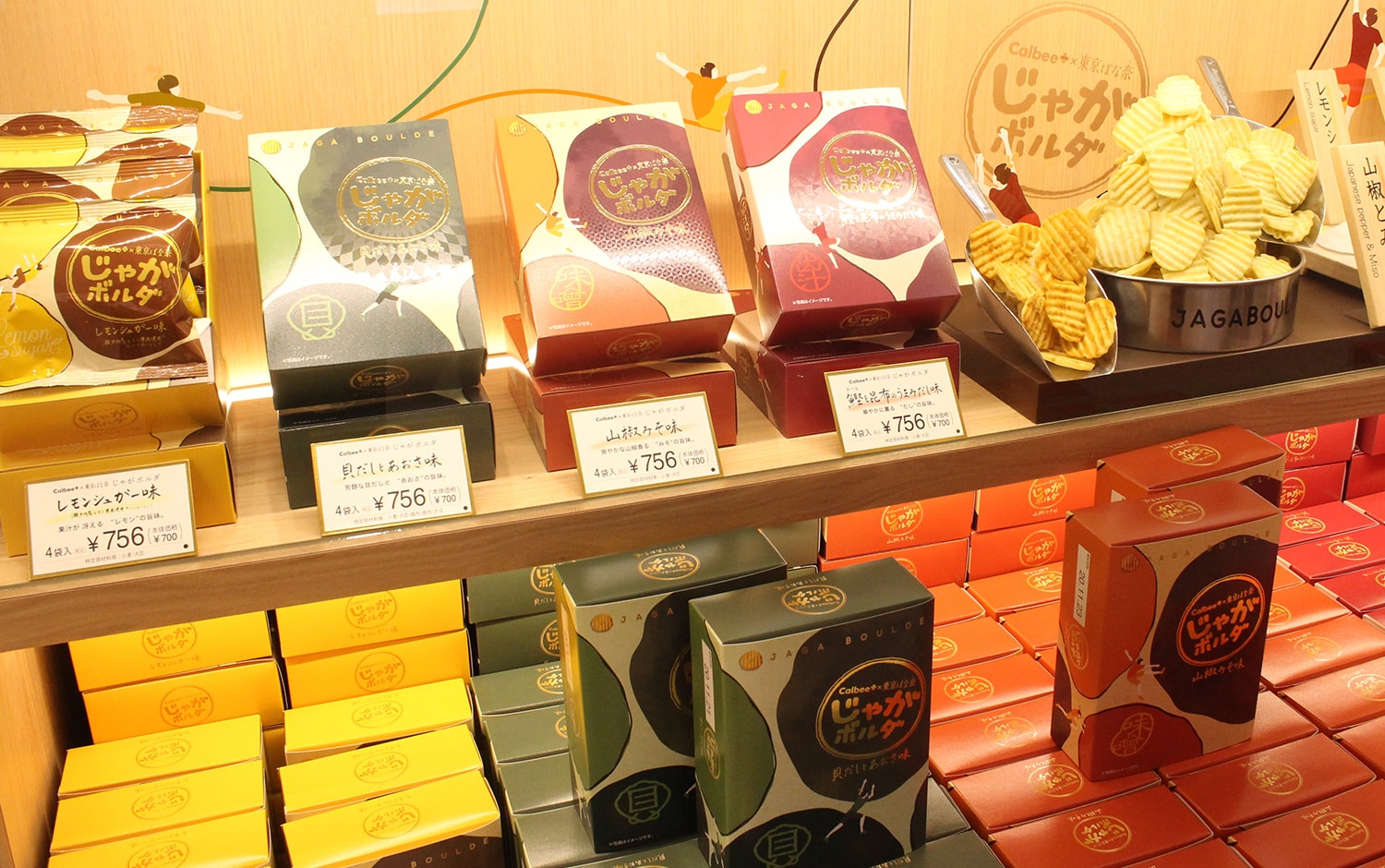
The idea, based on the theme of bouldering, an Olympic sport to be held in Tokyo, had a great impact as a souvenir, and the brand name “Jaga Boulde” was chosen.
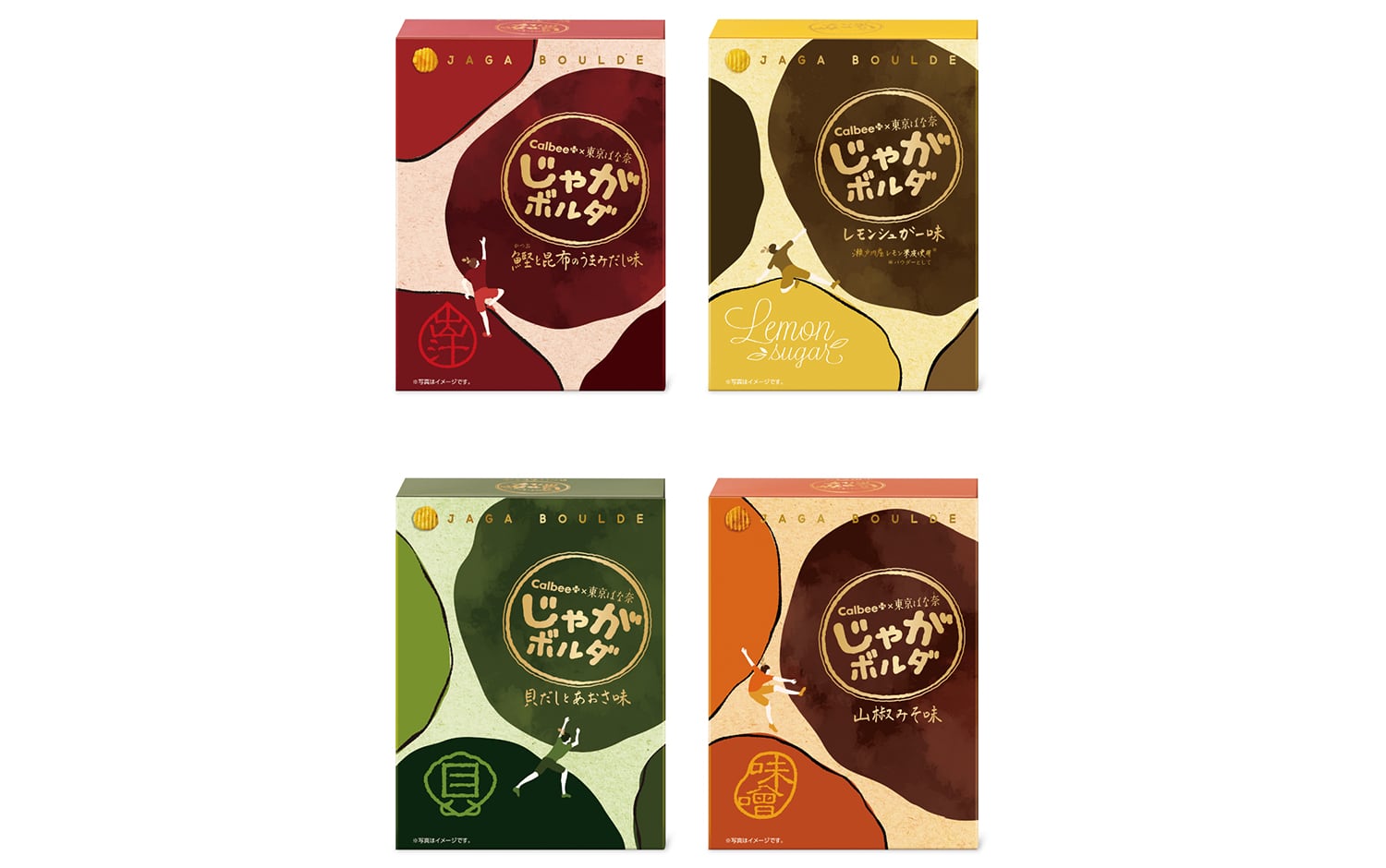
The next step was to find a way to express the exciting and exciting worldview of “Jaga Boulde” in the brand logo and package design, and the 30 designers assigned to the project faced this challenge with their own designs. Once the design proposals were shared within the company, the designers and consultants held discussions to brush up each design. Finally, multiple proposals were proposed after extensive consideration. The store where the new brand would be unveiled was located right outside the Shinkansen ticket gates, a location that would attract a lot of attention. Therefore, we adopted a sequential packaging idea that would capture the attention of visitors to the store, as if a large bouldering arena had appeared when the packages of the four flavors to be developed were displayed side by side. By changing the colors for each flavor, we were able to create a more accurate representation of the colorful and fun world of bouldering throughout the store.
In addition, a different pattern of varnishing was used for each flavor to create a tactile texture. In addition, on each individual package, the competitors brought a unique impact, and the foil-stamped gold logo enhanced the brand’s sense of luxury.
The fun and colorful bouldering concept common to the new brand’s naming, logo, and package design is also reflected throughout the store design and staff uniforms. The brand “Jaga Boulde” was born with strong equity. While many souvenir brands have a sophisticated atmosphere, the new brand with its unique worldview will quickly spread among consumers.
In 2022, the long-awaited new “Banana and Butter Flavor “Mi-tsuketa”” will be introduced. This product is a potato snack with a unique texture and features a banana and butter flavor.” The unusual collaboration of “potato” and “banana” is playfully represented in the packaging. The large, impactful potato is the centerpiece of the package, which also expresses a sense of deliciousness by incorporating a shimmering buttery image. The design tells a story.