- - Package Design
A new standard for a long-selling brand
Hyoketsu” was launched in 2001 under the concept of “creating a chu-hai that changes chu-hai. The refreshing and refreshing taste and the wide variety of flavors have made Hyoketsu so popular that it has become a long-selling brand that is so well known that it is almost unrecognizable.
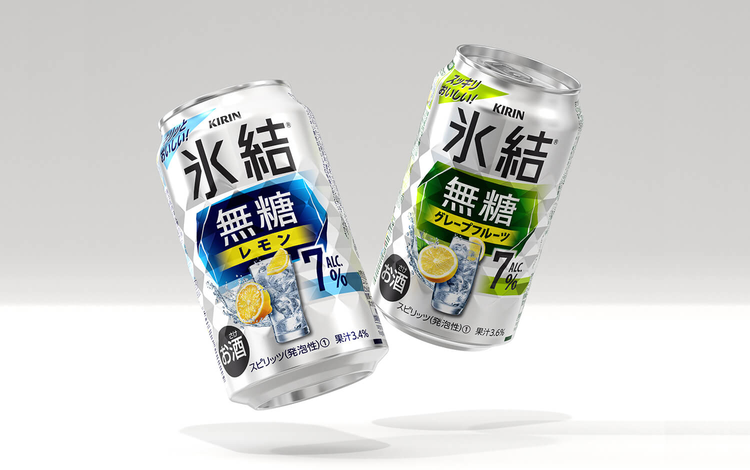
The new “Hyoketsu Sugar Free” series from the Hyoketsu brand is designed to meet the needs of consumers who are nowadays health-conscious and enjoy alcoholic beverages with meals. By using no sugar or sweeteners, the new series has a fruitier, less sweet taste.
Bravis has been involved with the Hyoketsu brand since its launch and is also responsible for the packaging design of the “Hyoketsu Sugar Free” series.
The use of white and silver colors expresses the clean, refreshing taste of the unsweetened product. The base color and the Hyoketsu logo are kept achromatic, while a blue panel is used to draw attention to the product’s unsweetened feature, even in the crowded store shelves. The base color and the Hyoketsu logo are kept bland and colorless. The design aims to differentiate the product from other chu-hi products, many of which have strong colors and designs.
Since its launch, this series has enjoyed strong sales growth, and flavors such as grapefruit have begun to appear in the market.