- - Package Design
The design is easy to grasp for women
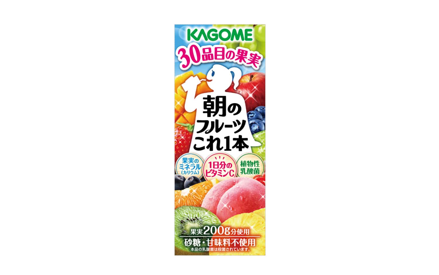
“Fruits Kore Ippon Series” is a fruit juice that uses 30 items of healthy fruits that are good for the morning provided by Kagome, a leading manufacturer of vegetable juice. It is a long-selling product that has been popular for more than 10 years since its release.
While maintaining the series feeling of “Yasai Ichiniti Kore Ippon“, each fruit is attractive. There was a need for a package that conveys the unique value of a wide range of products by making them look realistic and makes the target women feel even more familiar.
In the design renewal of “Asano Fruit Kore Ippon”, the linear silhouette of a person has been softened by using curves and an A-line. In addition, while maintaining the strength and legibility of the logotype based on the previous typeface, we added a classy impression by adjusting the thickness of the letters and adding decorations. By writing the logo horizontally and emphasizing “morning”, it is easy to imagine the drinking scene. It is a bright and delicious package that conveys the feeling of 100% fruit juice by increasing the freshness with water droplets and light, and has an overall soft impression with the main target women in mind.
In the design renewal of “Morning Fruits This One”, the silhouette of the figure, which had been straight, was softened and adjusted using curves and A-lines. In addition, the logotype was based on the previous typeface to maintain its strength and legibility, while adding a more elegant impression with stronger or less bold letters and decorations. The logotype is written horizontally and “morning” is emphasized in a large font to make it easier to imagine the scene of drinking. Water droplets and light enhance the freshness of the fruit to convey the feeling of 100% fruit juice, and the overall impression of the package is soft, bright, and delicious, with the main target of female consumers in mind.
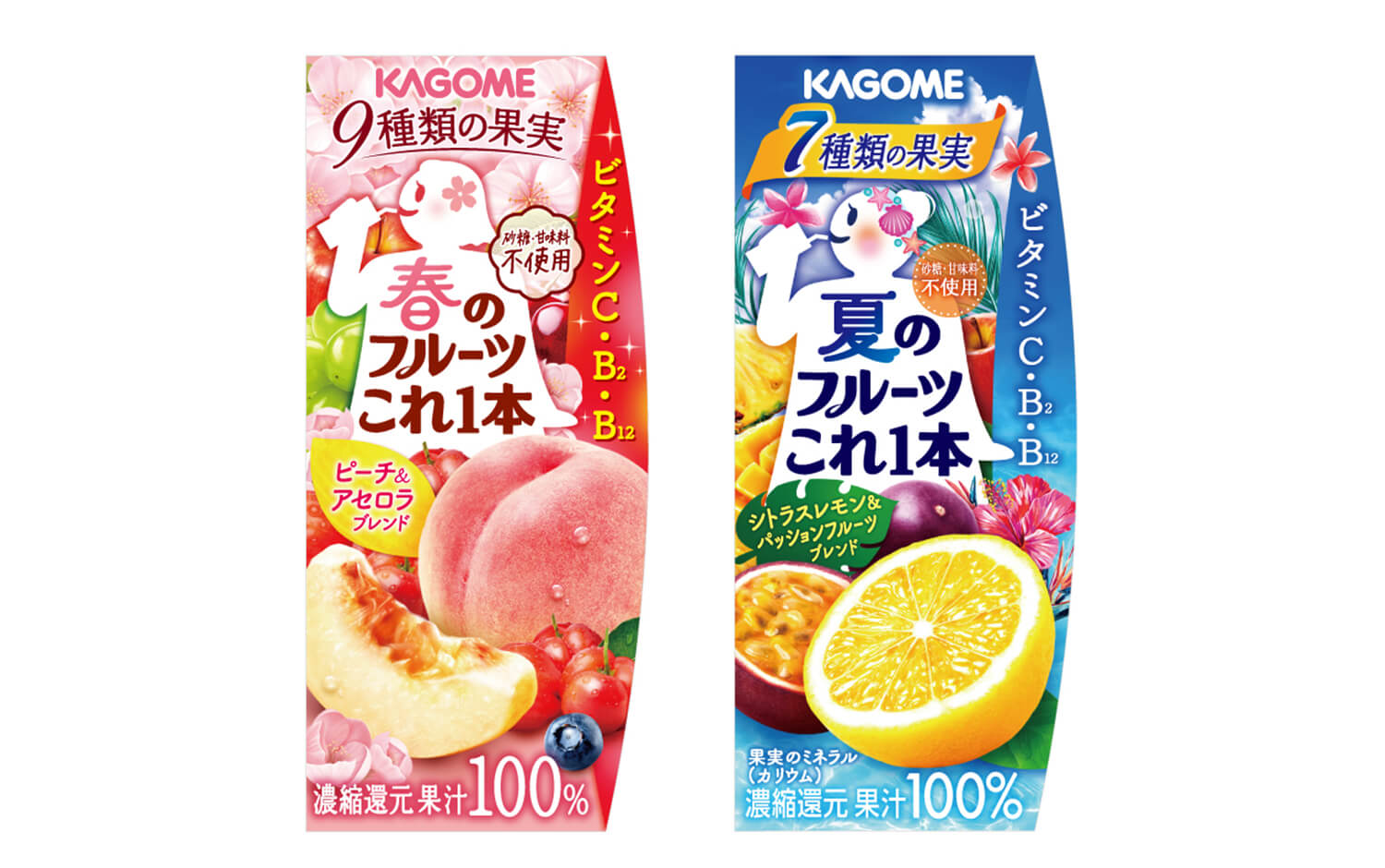
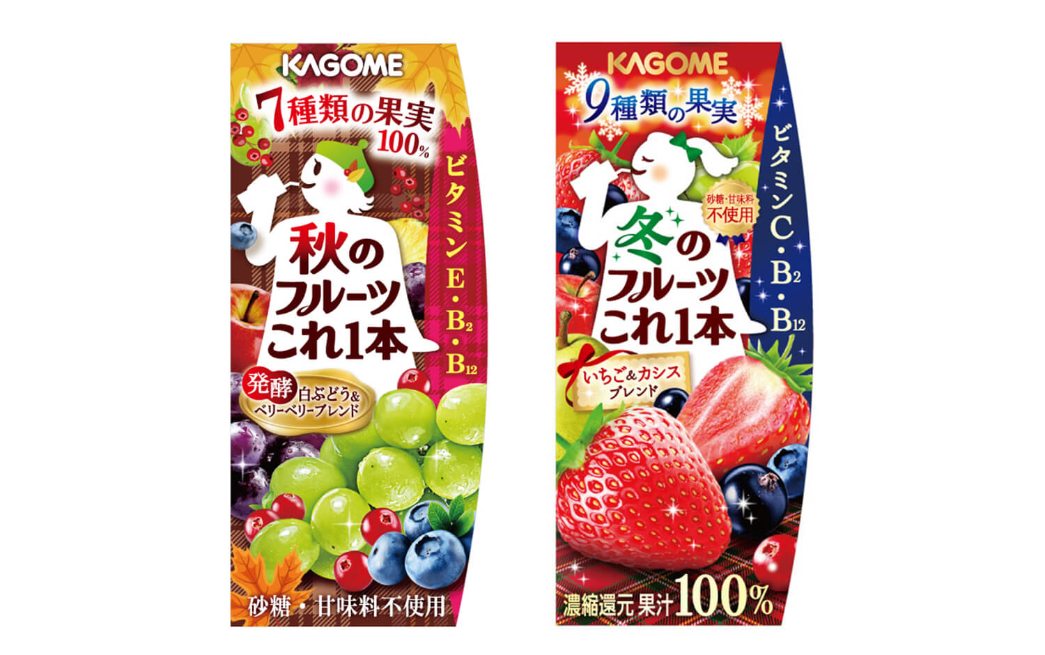
For the seasonal series, backgrounds and motifs that better convey the seasonality of each fruit are used to create a special feeling that the drink can only be consumed at that time of year. In addition to the overall tone of the package, the panel promoting the daily vitamin intake and the character’s hair ornament are designed to evoke each season, creating a sense of limited edition while maintaining a sense of unity as a series.