- - Package Design
Evolution of the brand image
Sofy’s nighttime sanitary napkin series “Super Sound Sleep,” known as the Unicharm sanitary napkin brand in China, has been widely loved since its launch in 2009, but consumer trends are changing, such as premium-oriented consumers and the importance of material quality in selecting products, and the Super Sound Sleep series needed to change as well. However, consumer trends have been changing, such as premium-oriented consumers and the importance of material quality in product selection criteria.
Currently, consumers already have a sense of security in the fact that these products are for nighttime use, which is one of their strengths. The challenge was to attract a new, younger consumer demographic while leveraging the existing strengths and appealing to them as a premium product that is more particular about its ingredients.
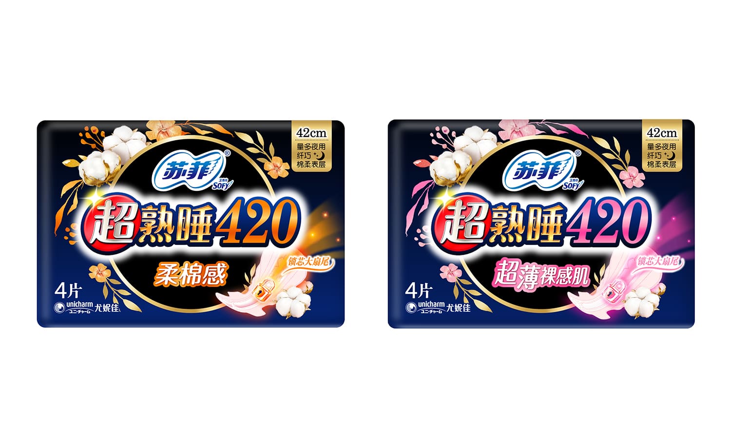
First, to make the product more appealing, we designed the product with a graphic of a key and a larger back part than other products to make it easier to understand the product features than ever before. The design also features a cotton and floral sizzle.
In addition, by designing the sizzle of cotton and flowers, we effectively expressed our commitment to the materials, which we had not been able to fully emphasize until now. While retaining the black image used in the past, the overall color of the package is dark blue with a gold circle in the center to create a sense of luxury.
The new design expresses the brand’s intention to lock in women’s nighttime worries and matches consumer preferences.